


My Legal Pro Trading
Design System
Project type: 0 to 1
Creating and establishing a unique design style and system from the ground up is a formidable yet enjoyable task. This becomes particularly interesting when a product lacks an existing design style library. In this endeavor, I developed a distinct design style and subsequent system from scratch, detailing the valuable contributions I made towards realizing a practical and advantageous design style.
Upon my arrival at My Legal Pro Trading, I was met with the thrilling challenge of crafting a design style and deploying a solid, enduring design style & design system. The urgency of this task stemmed from our need for a design template that was not only visually pleasing but also effective and effortless to apply across the spectrum of the company's digital assets, spanning both desktop and mobile apps.
My Role :
UI designer, UX designer, visual designer
Timeline
October - November 2023
8 mins read
Problems Statement
Existing My Legal Pro application products do not have a standard design style, and has implications for interface inconsistencies, interactions in applications.
So I’m doing the audit with current interface & try to build a new, fresh design style & design system
Old Interface

Dashboard : Old interface

Verification of identity : Old interface
Case detail page : Old interface
Case status timeline : Old interface
Above are some screenshot from the old interface before I joined. There is an inappropriate and seemingly random use of icons, a color combination that is not in accordance with the term "Legal" and inconsistent use of iconography.
As a first step, I conducted a thorough audit of the existing design elements to understand their strengths and weaknesses. From this analysis, I began to identify consistent design patterns and needs across the company’s products. The goal was to create a design system that facilitated cross-team collaboration, increased product development efficiency, and provided a more consistent and harmonious user experience.
Atomic Design Approach
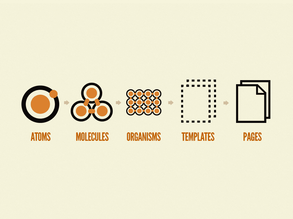
In building and designing design styles and design systems, I use Brad Frost's atomic design approach. Atomic design is a methodology composed of five distinct stages working together to create interface design systems in a more deliberate and hierarchical manner. The five stages of atomic design are:
Atoms
Molecules
Organisms
Templates
Pages
There are several reasons why I use atomic design.
Consistency in Design
By breaking the UI into atomic components, it promotes consistency in design and development, ensuring that elements are reused consistently across the application or website.
Easier Scalability
Atomic Design allows for scalability by organizing components in a hierarchical manner. This enables easy management and expansion of the design system as the project grows.
Reusability
Atomic Design promotes the reusability of UI components. Atoms and molecules can be reused across different parts of the application, reducing duplication of effort and maintaining a coherent design language.
Faster development
By working with smaller, independent components, developers can work in parallel and iterate quickly. Atomic Design's modular approach speeds up development and enhances collaboration.
Simplifying Team Collaboration
With Atomic Design, everyone on the team, from designers to developers to other stakeholders, works in the same language. Each component has a clear definition and purpose, which makes communication between teams easier. It also minimizes confusion and misinterpretation, especially in large projects with many team members.
Flexibility for Customization
This approach also provides great flexibility for customization. Since basic components can be combined in many different ways to form more complex UI elements, designers can easily customize and adjust elements as needed without having to create everything from scratch. This allows for dynamic and responsive designs to changing user needs.
In this case study, I will only discuss atoms and molecules, because these 2 items are the most fundamental when I will redesign the My Legal Pro application product.
Atoms
Atoms are basic elements like form labels, inputs, buttons, and other basic properties like colors, fonts, and border-radius that can't be broken any further. At an individual level, atoms are abstract concepts with no real meaning. But when combined, they start to create more meaningful elements called molecules.
Modifying a single atom has a ripple effect on the entire design. Change a font, for example, and the entire look of the site’s typography is changed. Atoms are likely to show up on a mood board that might be presented to stakeholders on a design project but aren’t really deliverables on their own.
Defining design style to implement.
Colors
Primary & Secondary Colors
In choosing the main color & secondary color scheme, I also involved the highest stakeholders to give their opinions. And the result is they want navy & gold for the color theme in the application product and we did agree. We defined the brand color identity should be navy & gold combined
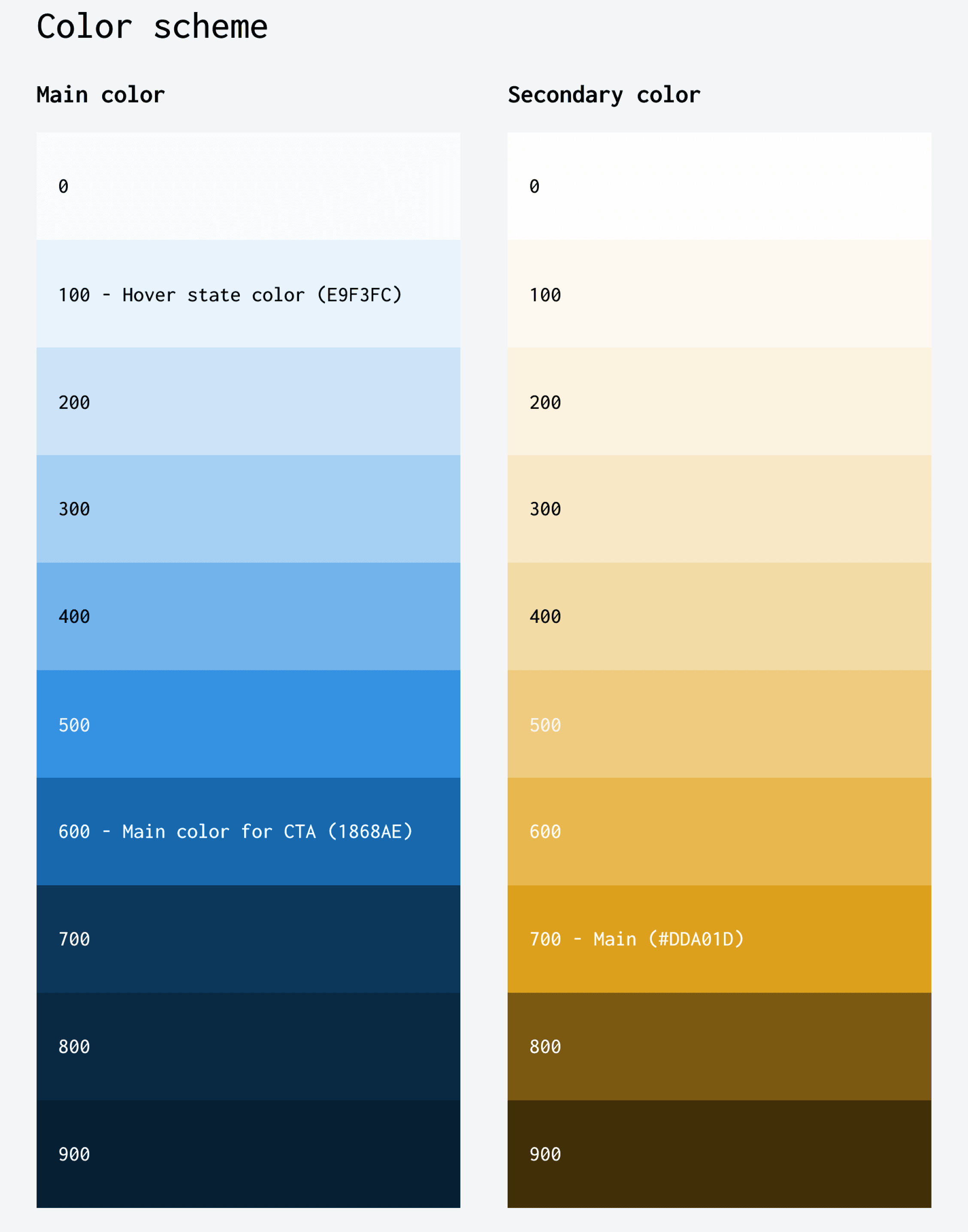


Neutral Colors
This neutral gray color is applied to text. The color scheme is to emphasize the hierarchy of the text. While the white color is divided into 2 levels, namely depth-backgorund and surface-background
Semantic Colors
Semantic color is a concept in UI/UX design and frontend development that involves using colors that are named based on their specific purpose or meaning within the context of an application, rather than based on the description of the color itself. In this case, colors are assigned a specific intent, such as "warning color," "success color," or "primary color," rather than "red," "green," or "blue."

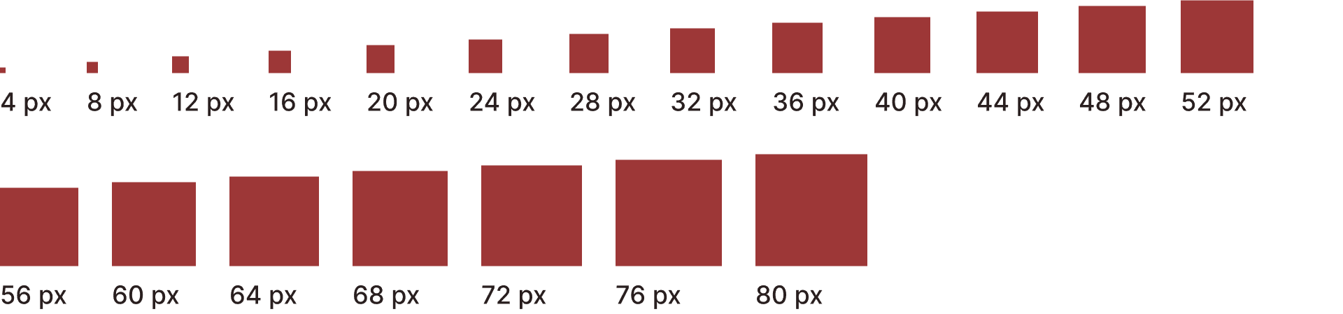
Spacing System
I use a multiple of 4 for this spacing system. This spacing itself is a guide to determine how much negative space is for content on the interface that will be built into the product later.
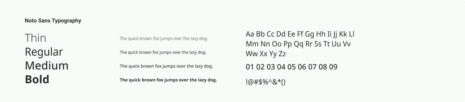
Typography
We use Noto Sans from Google font considering readability and formal style, but not stiff, font style. As well as a fairly diverse variety of font weights
Reading quality
Set environment for reading to suit the reader. Big lines of text are hard to read and make it more difficult for people to concentrate. Although there is no ideal way to calculate the optimal width for text, aiming for between 40 and 96 characters per line including spacing is a reasonable goal. Setting an optimal line length will break content into easy-to - digest material.
Readers may also have control over the width of the layout; that is, a line length is not always specifiable. So designing for an ideal line-length range under normal circumstances is a good practice, and using responsive design techniques to anticipate different contexts.
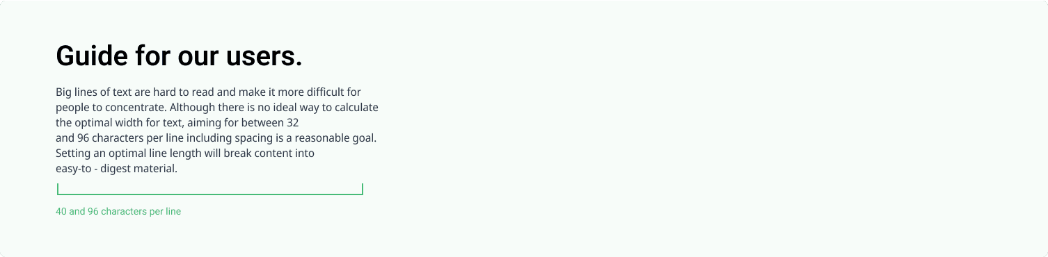
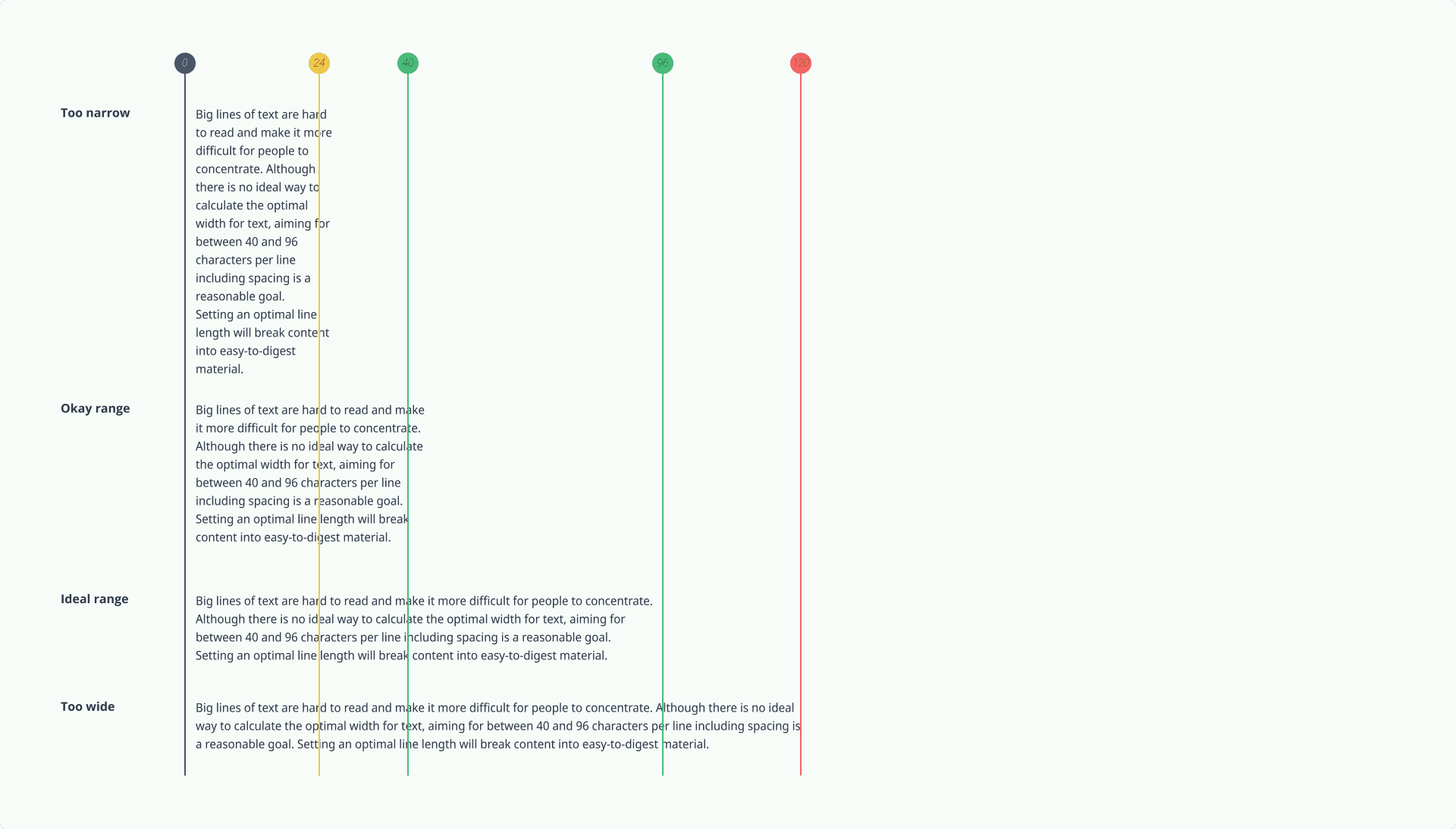
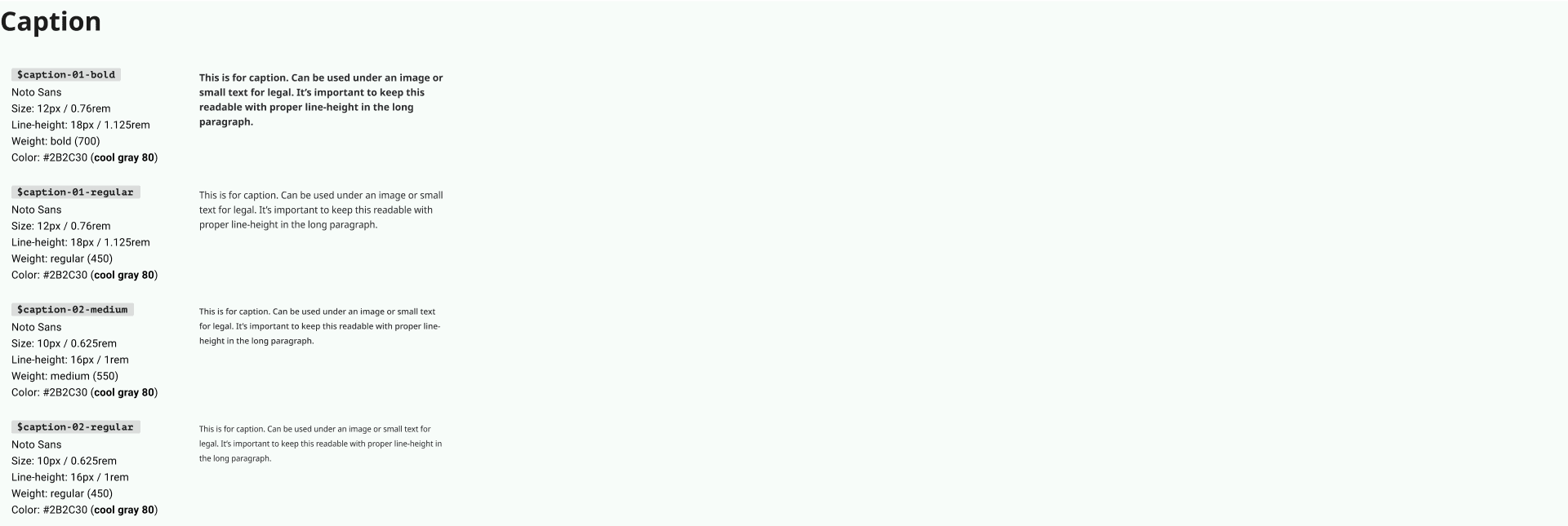

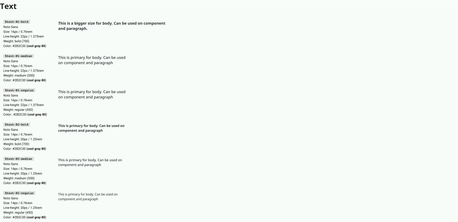

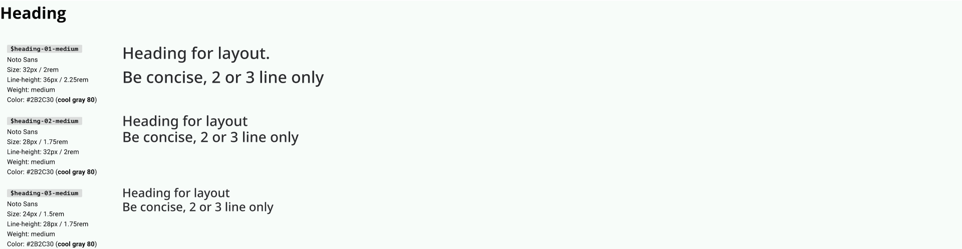
Image : Typography token
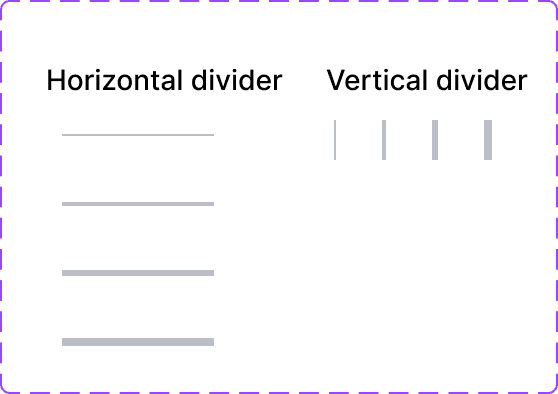
Divider
Grid System
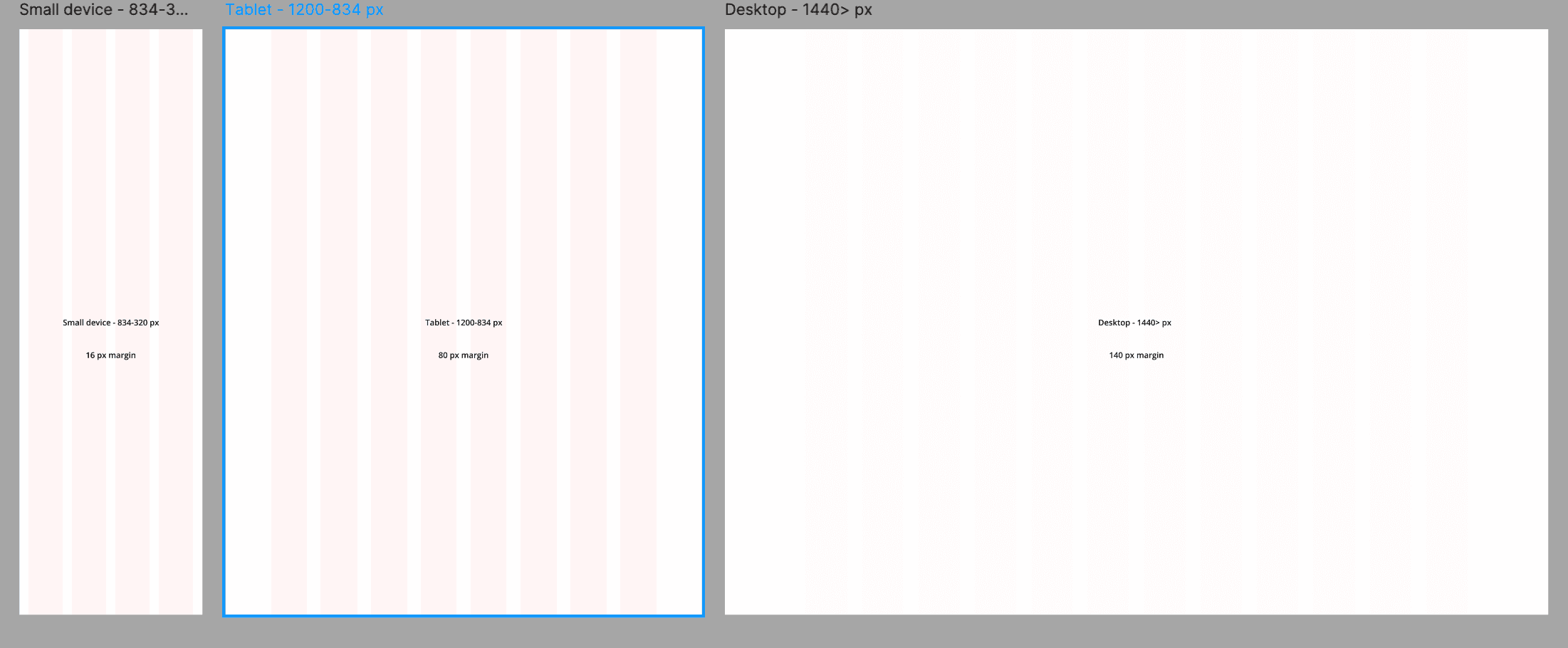
Image : Grid system in various device size
Iconography

Image : Grid system in various device size
We use three size and thickness variations for the icons. Each of these size variations will be used for different purposes.
Button

Image : Button components
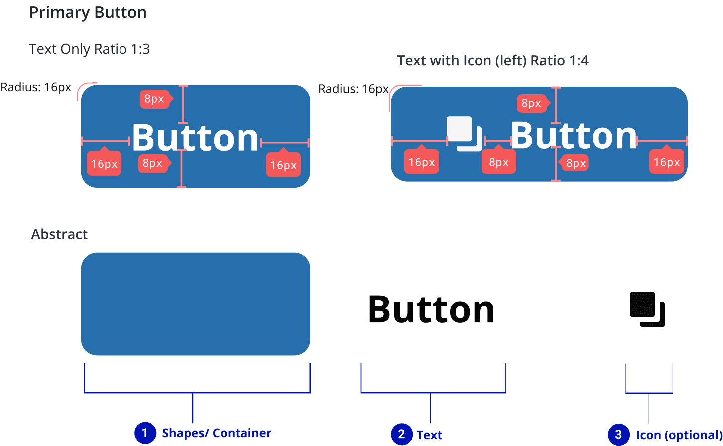
Image : Button anatomy
Molecules
Molecules are made up of atoms bonded together. They are simple UI components like buttons, checkboxes, inputs, and similar elements functioning together as a unit.
Text Fields
Edit state
Focused state
Error state
Disabled state
Default state

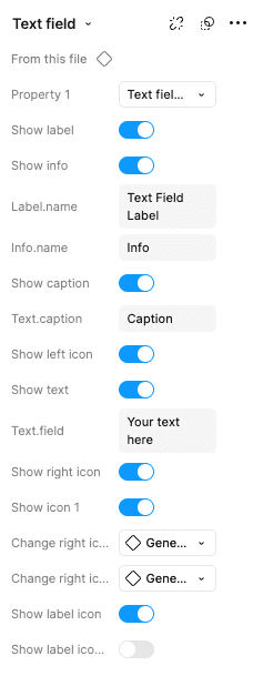
Image : Text field variations
To minimize the use of too many component variations and burden the development process, this text field is maximized in the settings on its properties. As in the picture, I use variables to facilitate collaboration between designers and developers.
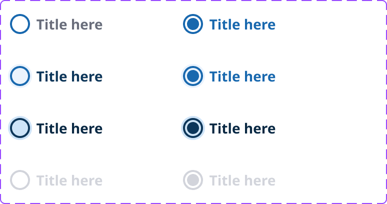
Radio Button

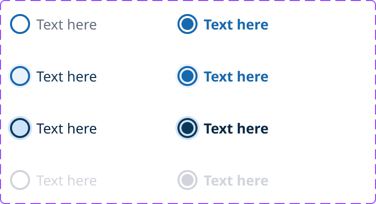
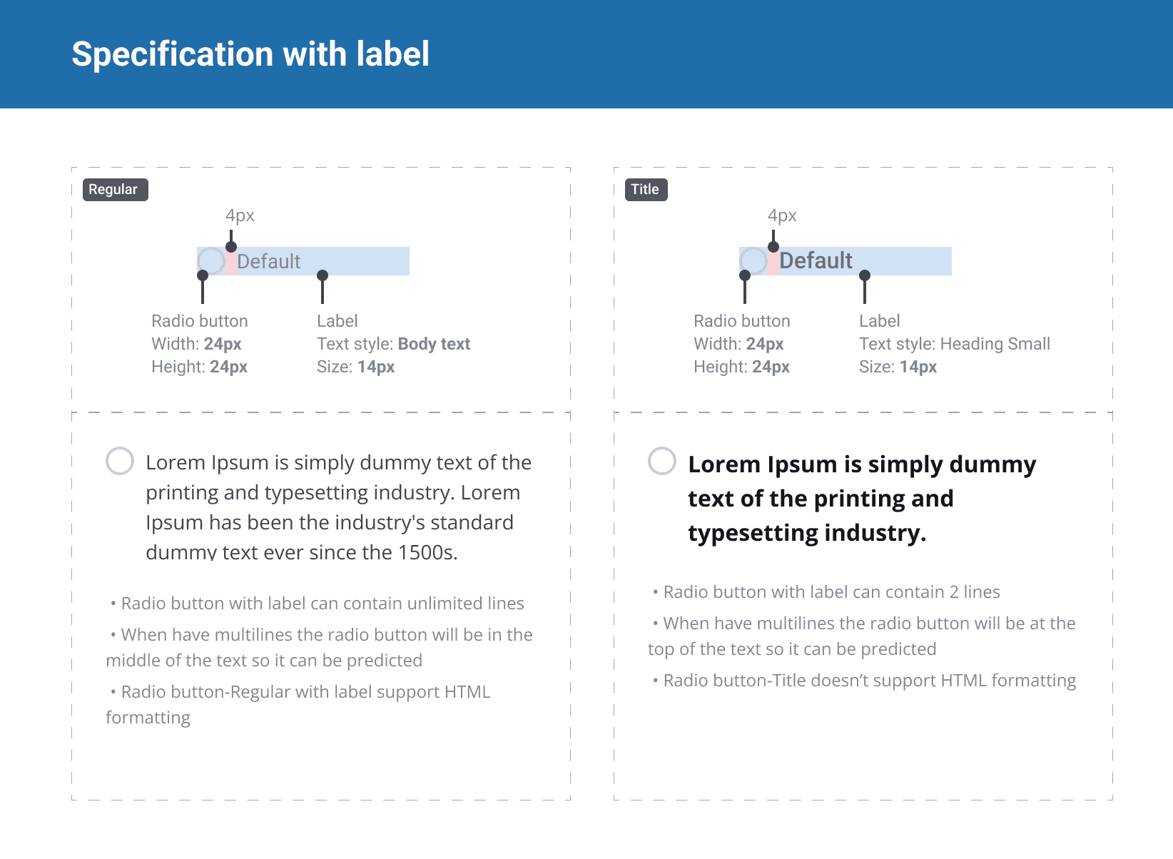
Image : Radio button anatomy
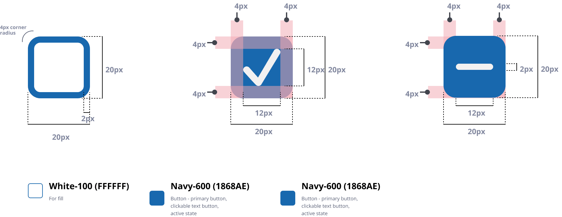
Checkbox
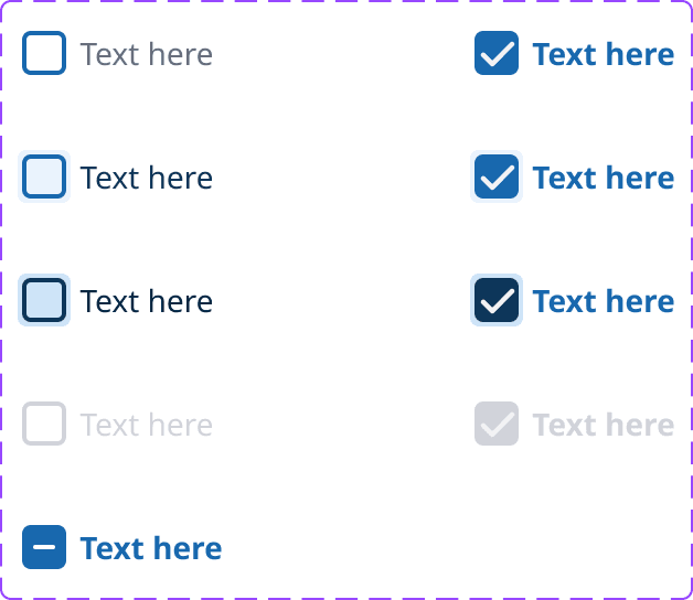

Image : Radio button anatomy
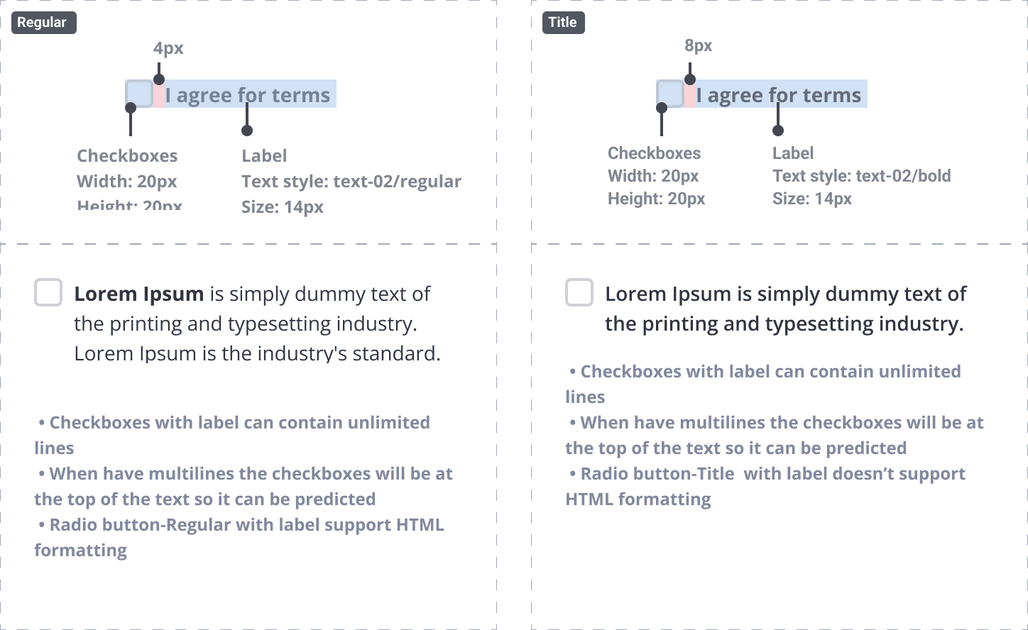
All above are basic components that I’ve created & built before I start design projects. At the first step is it enough for me, and along the way new components will be built again according to needs of design project.
Lesson Learned
From the experience of designing and building design styles and design systems, there are many valuable lessons that I have learned.
First of all, I learned how important it is to maintain consistency in every design element. This consistency is not only about a uniform appearance, but more about how users can feel comfortable and familiar when interacting with our products. For example, by using semantic color, we can ensure that every visual element, such as a button or warning message, always means the same thing throughout the product.
I also experienced firsthand how a good design system can make teamwork much more efficient. When I work with a development team, having clear design guidelines helps us all stay on the same track. So, there are no more different design styles, or mistakes that arise simply because of miscommunication because we have one source of truth.
Equally important is flexibility and scalability. With a modular approach like this, I don't have to bother changing the entire design if something needs to be updated. Just change it in one place, and the entire application will automatically follow. This makes iteration much faster and easier to maintain. Plus, this flexibility is very helpful when we have to quickly respond to changes in business needs or user input.
Another thing I realized is accessibility. Accessibility should not be taken for granted or added later. By considering accessibility from the start, such as choosing the right colors and contrast, we can ensure that our products can be used by everyone, including those with visual impairments. I use WCAG 2.1 standard for accessibility guideline.
Of all these lessons, one thing that really convinced me was that a solid design system can make us move faster and more confidently. With consistent, accessible, and flexible design, we can not only meet user expectations, but also continue to innovate and adapt quickly. And that is the key to building a truly user-centric product that is successful in the market.
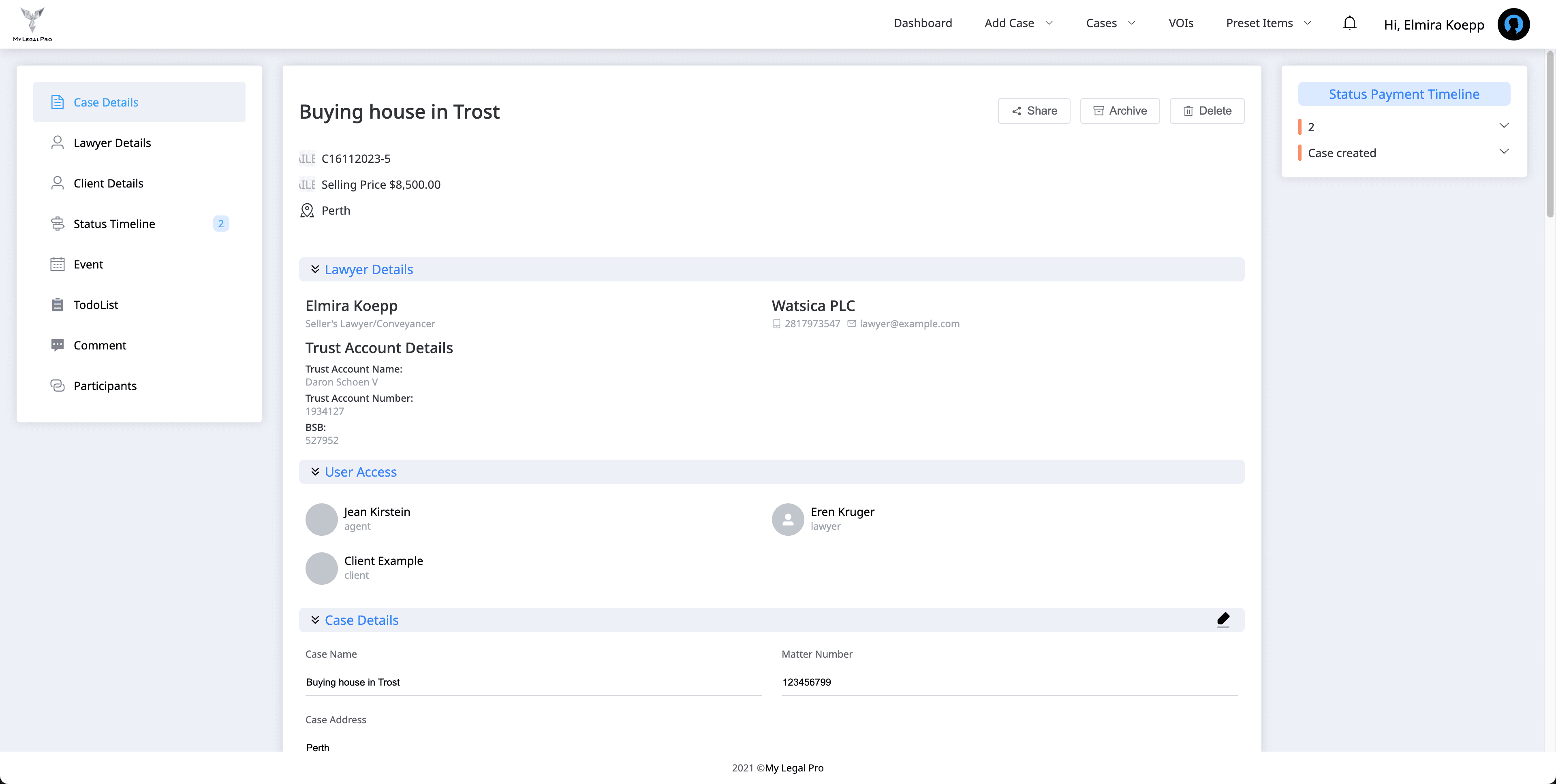
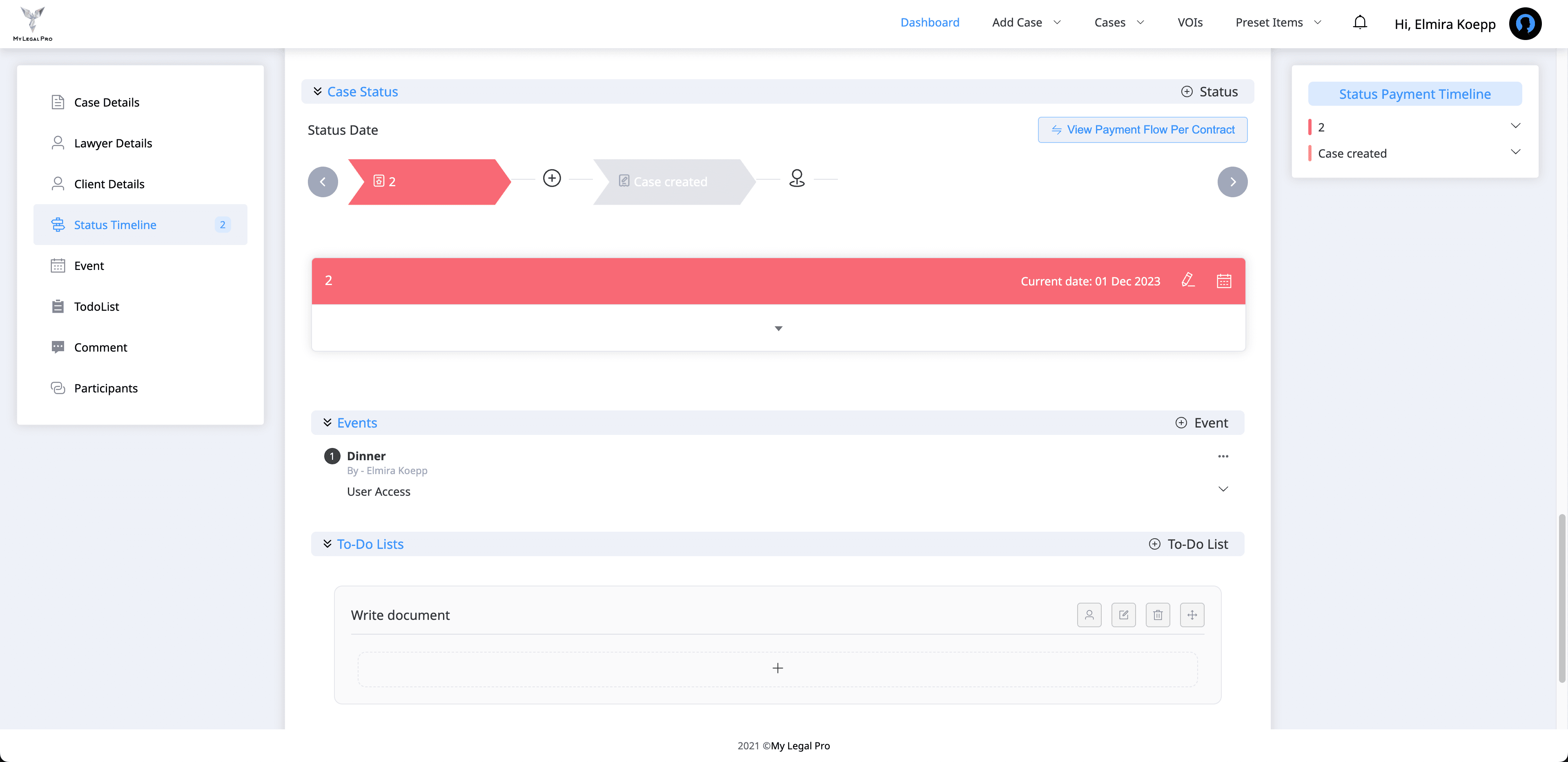
Visual Gallery : New Design Style Has Been Implemented
Here are some of the latest visual images that have adopted the new design style.
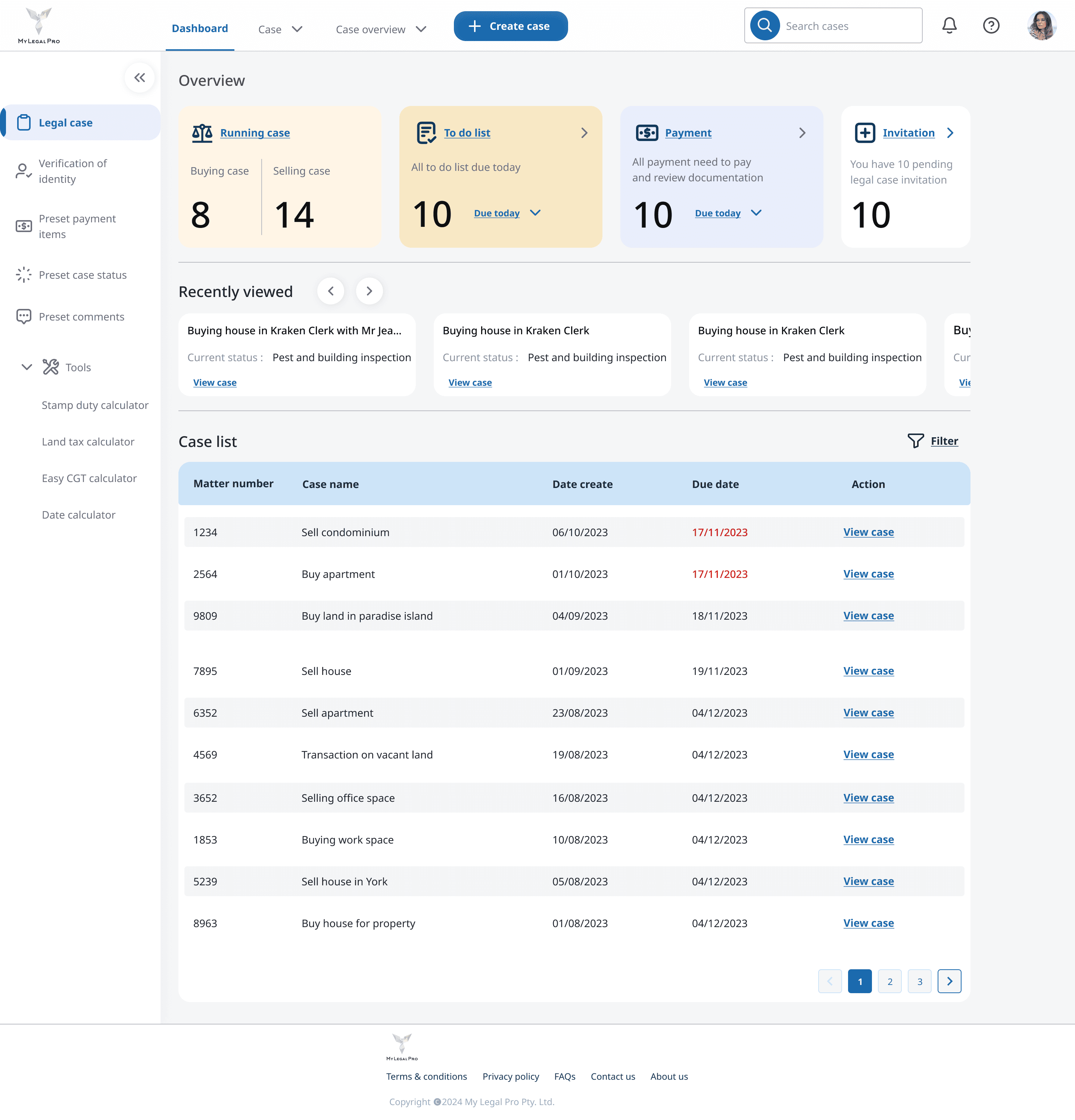
Image : Dashboard
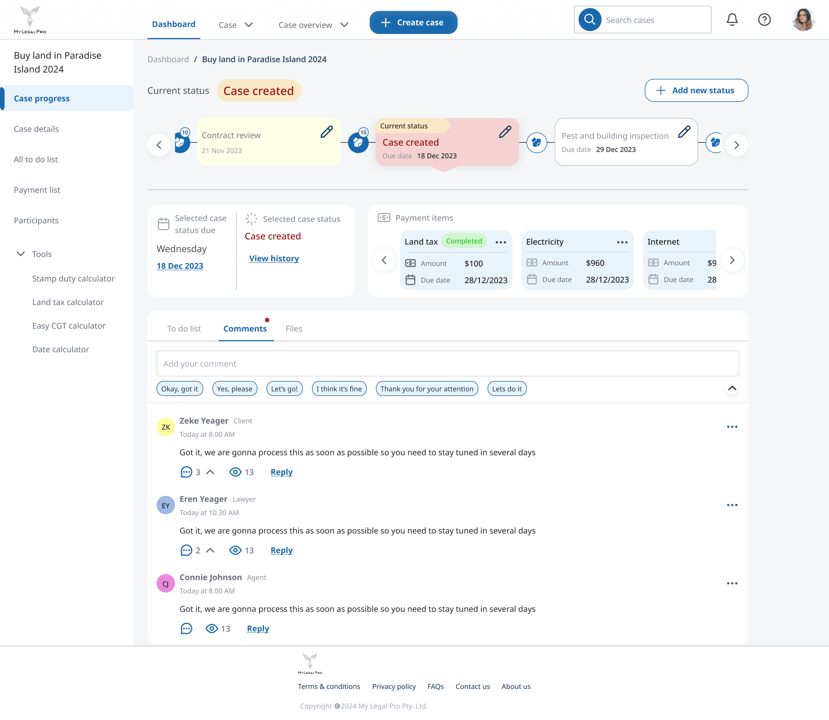
Image : Case detail page | Comments section

Image : Case detail page | To do list. Use of color codes to define case status

Image : Create new case