My Legal Pro Trading
Design System
Project type: Improvement
Upgrading Design System: Transforming our workflow with Figma Local Variables
When our team first built the design system, we relied heavily on Figma’s regular components and styles to maintain consistency. At the time, Figma Local Variables hadn’t been introduced yet, so we managed colors, spacing, typography, and other design tokens manually. I lead this project.
My Role :
UI designer, UX designer, visual designer
Timeline
January 2025
5 mins read
The Impacts
🚀 80% Faster Theming
We could now switch themes in minutes instead of hours, making customization effortless.
🚀 Reduced Design Debt
Consolidating styles into Local Variables removed inconsistencies and unnecessary overrides.
🚀 Better Dev Handoff
Developers could now map Figma variables directly to code, reducing back-and-forth communication.
🚀 Future-Proofed System
With Local Variables, our design system became much more scalable and adaptable for future needs.
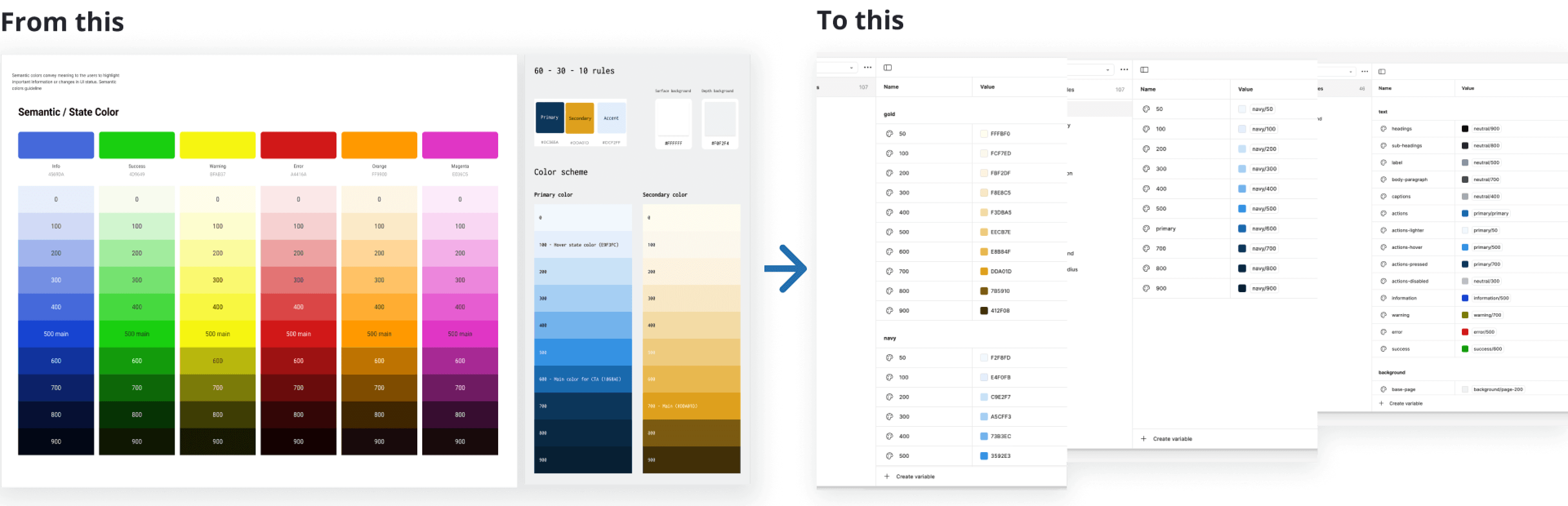
From this
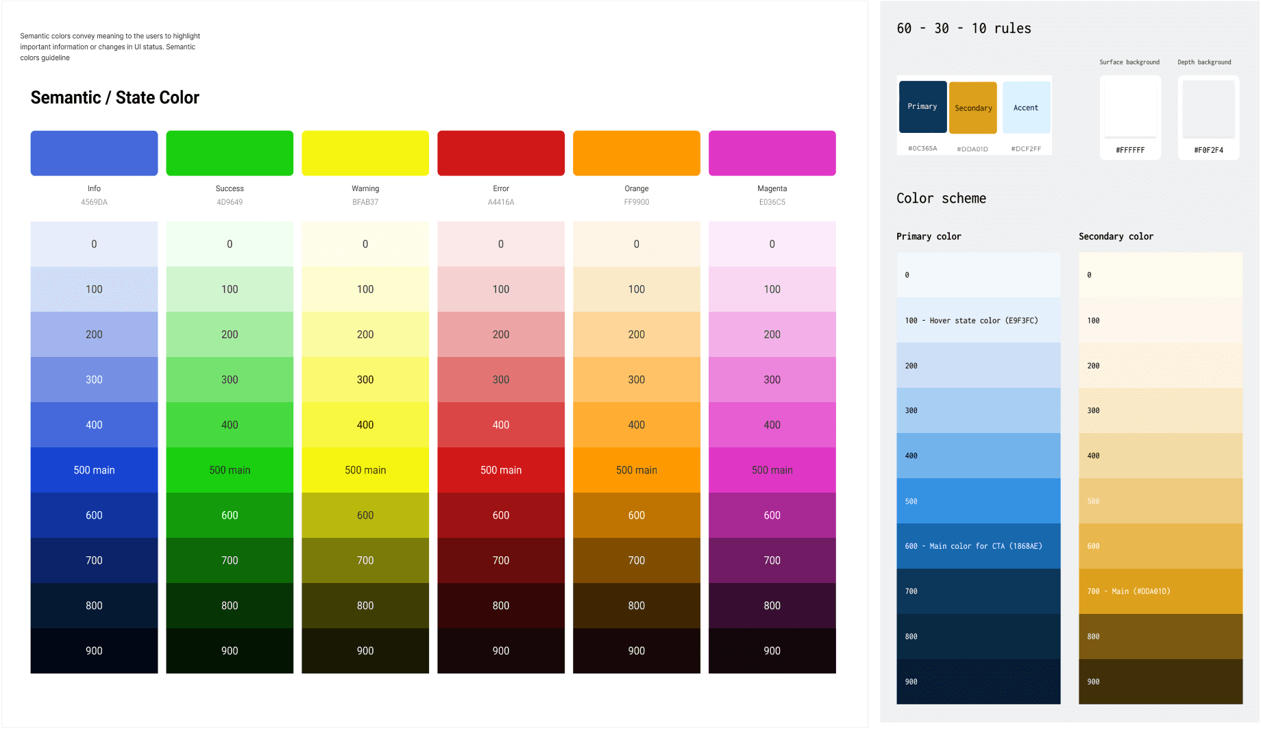
From old school & manual color style component adjustment
To this

Figma Variable. 1 primitive level color to rule them all
Background
When our team first built the design system, we relied heavily on Figma’s regular components and styles to maintain consistency. At the time, Figma Local Variables hadn’t been introduced yet, so we managed colors, spacing, typography, and other design tokens manually. This approach worked, but as our product scaled, we started to feel the limitations especially when it came to maintaining multiple themes, handling overrides, and ensuring consistency across different platforms.
Then, Figma introduced Local Variables, a game-changer for design systems. These allowed us to store and manage design tokens directly in Figma, reducing the dependency on scattered styles and making our system more scalable and adaptable. It was clear that migrating our design system to fully leverage Local Variables would be a huge improvement in efficiency, consistency, and flexibility so we took on the challenge.
Problems
Our existing design system, while functional, had several pain points:
Manual Updates : Any change to colors, spacing, or typography had to be updated across multiple components individually.
Lack of Scalability : The system was difficult to maintain as we expanded to multiple themes and design variations.
Inconsistent Overrides : Designers often applied overrides manually, leading to discrepancies between components.
Limited Collaboration with Developers : Our tokens didn’t directly map to what developers were using in code, leading to inefficiencies.
We also often find that there are many inconsistencies in the spacing and border radius used. This is a challenge because so far, the input value has been done in multiples of 4, but does not have a specific alias.
With these challenges in mind, we set a clear goal: Redefine our design system using Figma Local Variables to improve efficiency, maintainability, and collaboration.
Structuring the New Variable System
Figma Variable Diagram Principle
In building a consistent and measurable design system, we have used the atomic design approach from the start. However, the implementation of atomic design did not go so well because when changing the color hex code, it did not have implications for the global assets.
But this problem can be solved when the Figma variable feature is released, because we can build from the smallest atom, which has not been given a specific name or for a specific role. For example, like the Navy color used as the primary color, instead of naming it from the start, we only enter the hex code first at the Primitive level.
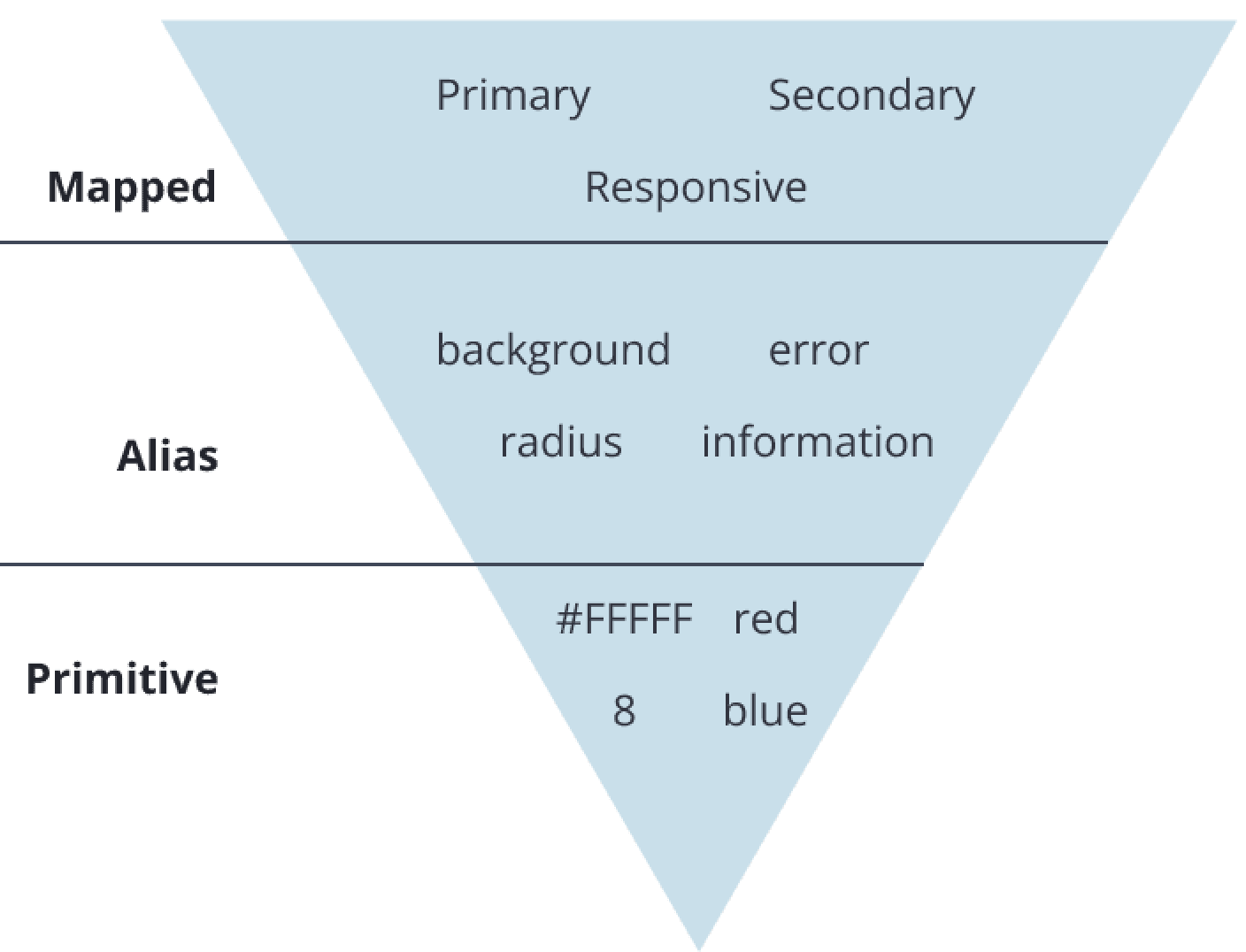
Primitive : All basic brand colors, numbers, etc, not assign a role, just pure hex code & number
Alias : It’s starting assign the purpose of each defining items
Mapped : Giving alias specific role
We took a systematic approach by grouping our variables into logical categories:
Color Variables : Primary, Secondary, Background, Border, State (Hover, Active, Disabled)
Spacing Variables : Small, Medium, Large
Typography Variables : Heading, Body, Caption, Button
Radius & Shadows : Standardized corner radii and elevation levels
By doing this, we ensured that every element in the UI referenced a variable instead of being hardcoded, making future updates effortless.
Defining Variable items
Figma Variable are very useful in atoms scale
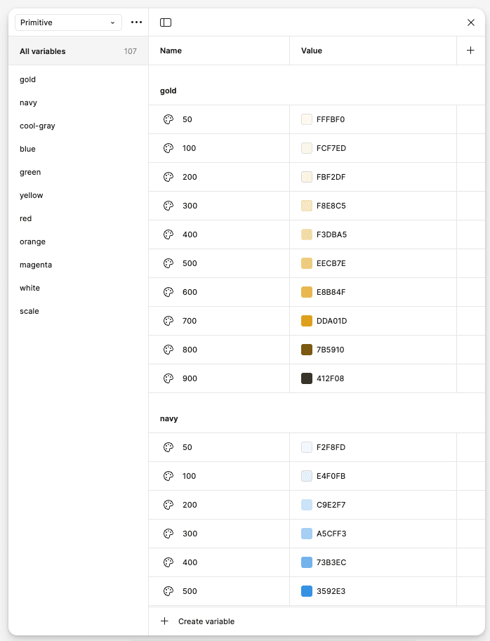
Primitive Level
Primitive variables are the core values of design system. They store raw, unlinked values such as colors, spacing, typography, and numbers.
At this primitive level, all kinds of colors, numbers used are in their original or raw form. We have not identified these colors for what specific task. As seen in the image on the side, there is only the color name and the color palette number.
Alias Level
Alias variables are references to other variables instead of direct values. They allow to create contextual relationships between design elements.
Alias level is when the color is associated with a certain task. For example, here the color navy is the Primary color that will be used for the color of buttons, navigation, tabbing and so on. Likewise with other semantic colors such as red for error indicators, green for success indicators and so on.
To assign an alias, you can right click, then when the pop up menu appears select "Create alias".

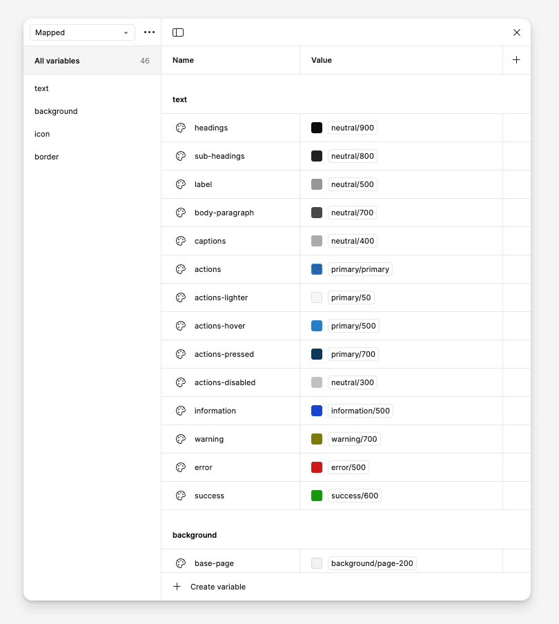
Mapped Level
Mapped variables allow you to switch variable values based on different modes (e.g., Text colors, background, icon, etc).
The Migration Process
Auditing the Existing Design System
Before making any changes, we conducted an audit of our existing styles and components. This helped us :
✅ Identify redundant styles that could be consolidated into variables
✅ Categorize tokens into color, spacing, typography, radii, shadows, and motion
✅ Spot inconsistencies in how components were using styles
Structuring the New Variable System
We took a systematic approach by grouping our variables into logical categories:
💡 Color Variables : Primary, Secondary, Background, Border, State (Hover, Active, Disabled)
💡 Spacing Variables : Small, Medium, Large
💡 Typography Variables : Heading, Body, Caption, Button
💡 Radius & Shadows : Standardized corner radii and elevation levels
By doing this, we ensured that every element in the UI referenced a variable instead of being hardcoded, making future updates effortless.
Implementing Local Variables in Components
Once our variables were set up, we started replacing all fixed values in components with their corresponding Local Variables. This step:
🔹 Ensured every design element pulled from a single source of truth
🔹 Made updating themes instantaneous (e.g., light & dark mode switching)
🔹 Helped designers work faster without worrying about inconsistencies
Testing & Iteration
After implementing the changes, we rigorously tested our components:
✅ We checked theme switching to ensure all colors adapted properly
✅ We validated spacing and typography updates across different screens
✅ We gathered feedback from designers & developers to fine-tune token organization
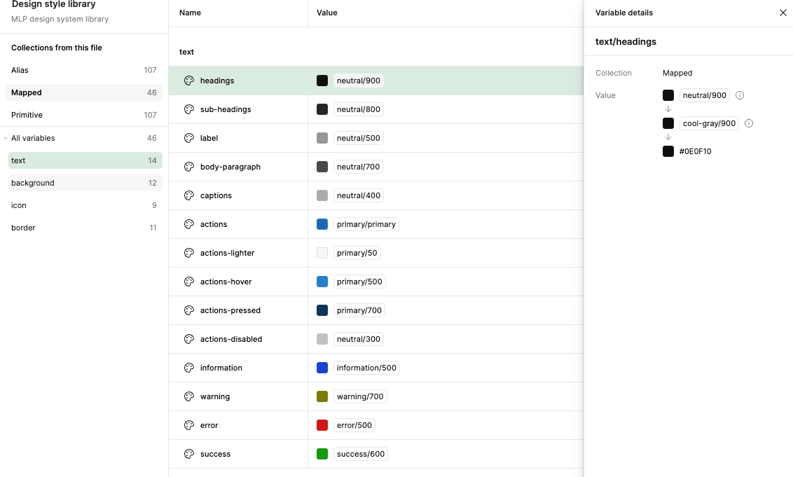
How it looks on developer mode
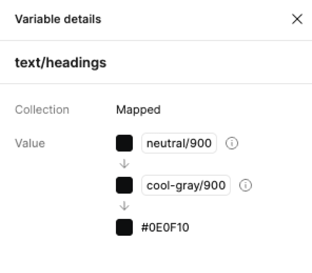
Variable details
Local Variables can be aligned with design tokens used in development, making handoff between designer and developer smoother.
Lesson Learned
✅ Investing in a scalable design system pays off
The transition to Local Variables required effort upfront, but it saved countless hours in the long run.
✅ A well-structured variable system = seamless updates
Grouping variables logically made it much easier to expand themes, tweak designs, and maintain consistency.
✅ Stronger design-dev collaboration
Developers appreciated how Local Variables aligned with code, making implementation smoother.