


Tictag
Design System
Project type: 0 to 1
Solving Design Debt: Foundation Build Tictag Design System
Build a design system and foundation, fix design debts and implement new design system to the product apps.

Project Background
Tictag is a Singapore-based startup specializing in data annotation and collection for AI and machine learning (ML) models. The company provides a gamified, mobile-first platform that leverages crowdsourcing to collect, annotate, and manage various types of data, including images, text, and audio
This is a part-time project. In order to create a proper and scalable design system, with my expertise in design systems, Tictag recruited me to help them build & create a proper design system and its documentation in the design system building project, this project lasted 2 months with the division of the first month focusing on creating and building a design system using the Atomic Design method, then the second month was re-skinning.
Scope of projects :
Proper design foundation such as color, typography, design tokens, variables, naming, brand guidelines, design storybooks
Design components that gonna be use by designer
Re-skinning current interface on apps
Maintain design system consistency
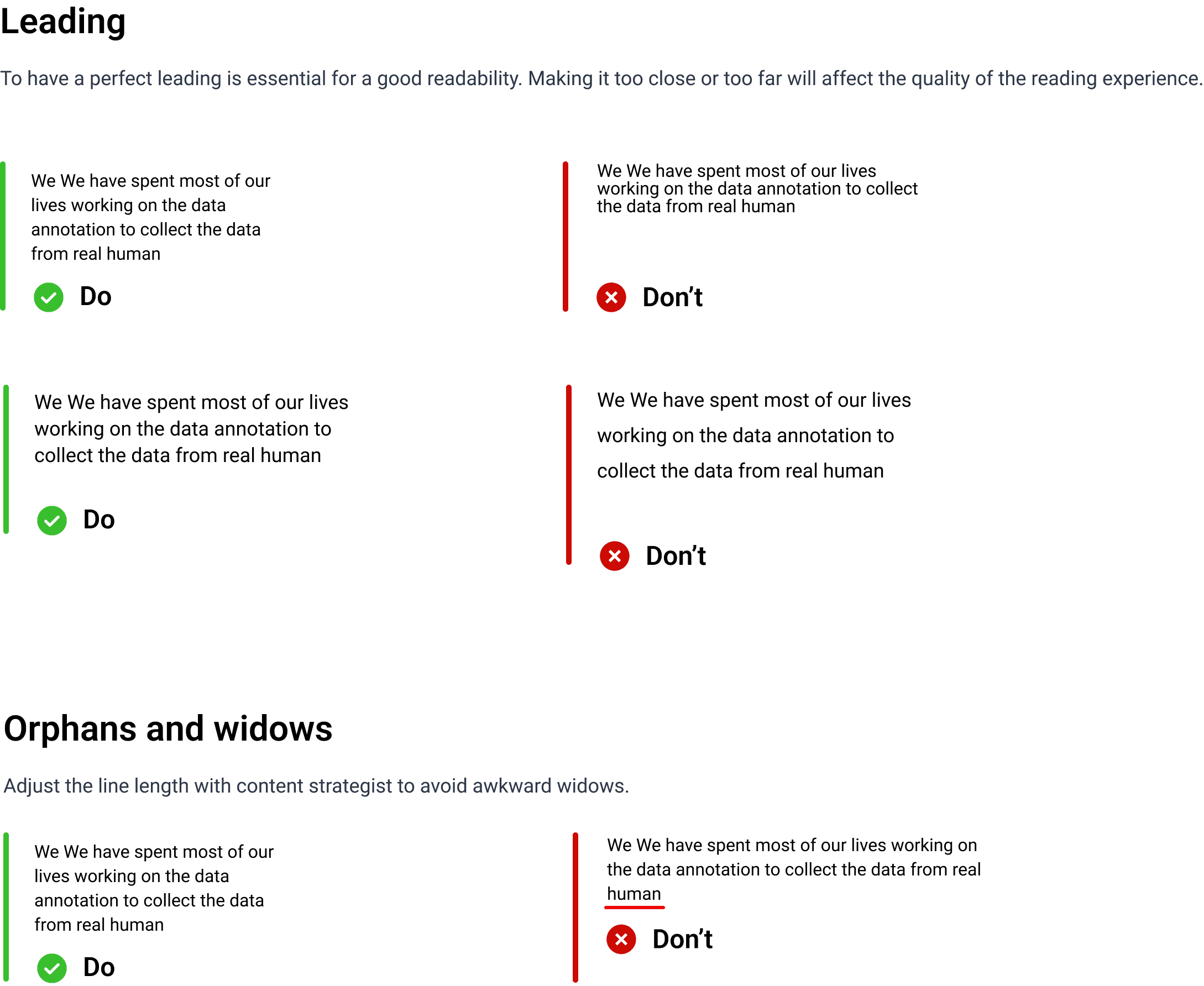
Design Debts
Design debt refers to the accumulation of design inconsistencies, inefficiencies, or usability issues that arise over time in a product due to rushed decisions, lack of documentation, or poor maintenance of design systems. It is similar to technical debt, where shortcuts in development lead to long-term issues that require costly fixes. What causes design debts in Tictag design?
Internal design teams are on high peak of project backlog. They have time limitation to pickup a design system and make documentation. While the project must go on without any proper design system, it might increase scalability of design debts
Lack of a design system – Without a structured design system, teams may create inconsistent UI components, leading to a fragmented user experience.
Short-term thinking – Prioritizing speed over design consistency, leading to temporary solutions that become permanent problems.
Impact of design debts :
Inconsistent UI/UX: Users experience confusion due to mismatched patterns or components.
Higher Development Costs: Developers spend more time fixing inconsistencies rather than building new features.
Longer Onboarding for Designers: New designers struggle to navigate an unstructured design ecosystem.
Reduced Brand Cohesion: A disjointed design language weakens brand identity and credibility.
Project Details

Image: Interface audit (one of pages that I did audit)
Why Do I Conduct This Audit?
Ensure consistency across products.
Improve design efficiency and developer handoff.
Reduce design debt and component redundancy.
Align the system with brand and accessibility guidelines.
Identify gaps in documentation and usage.
From the audit, I can arrange my plan to move on to the next step
Define Scope & Goals
Determine what aspects we’re auditing
UI components
Typography
Accessibility
Colors
Identify the key stakeholders
Designers
Developers
Product managers
Set measurable goals
Reduce duplicate components by 20%
Identify Redundancies & Gaps
Remove unnecessary variants.
Merge similar components.
Create missing components or guidelines.
Prioritize & Implement Fixes
Categorize issues based on severity (high, medium, low).
Collaborate with teams to update the system iteratively.
Evaluate Key Areas
UI Components
Check for duplicate or outdated components.
Ensure proper naming conventions and categorization.
Validate spacing, padding, and alignment consistency.
Typography
Audit font styles, sizes, and usage across different products.
Ensure correct implementation in both design and code.
Color & Theming
Identify inconsistent color usage (e.g., multiple shades of the same color).
Verify contrast ratios for accessibility compliance (WCAG guidelines).
Spacing & Layout
Standardize spacing values (e.g., 4px, 8px, 16px).
Ensure a responsive grid system.
Icons & Illustrations
Check for uniformity in icon styles and sizes.
Avoid unnecessary variations of the same icon.
Accessibility Compliance
Verify color contrast ratios.
Audit navigation and screen reader support.
Documentation & Guidelines
Ensure every component has usage guidelines.
Project Constraints
After the first brief with related stakeholders, this design system project will more or less take references from Google's Material Design 3. This is done to speed up the development process because the developer team can take the source from the Material 3 library, and I can copy and tweak Google's Material 3 design components according to Tictag's needs.
I divided design process into 2 sections, first one is build design foundation that include atoms component, and second one is design system components
Design Process 1: Build the Design Foundations
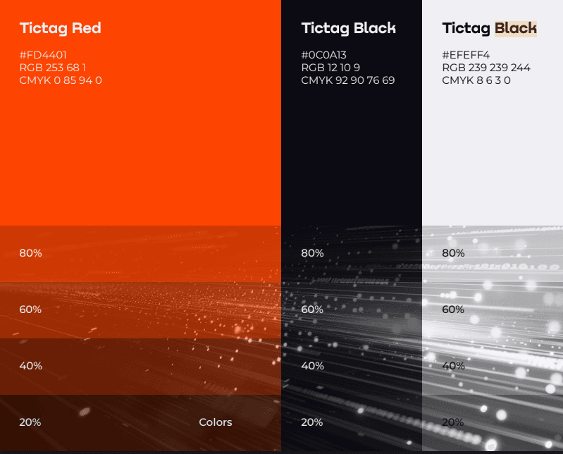
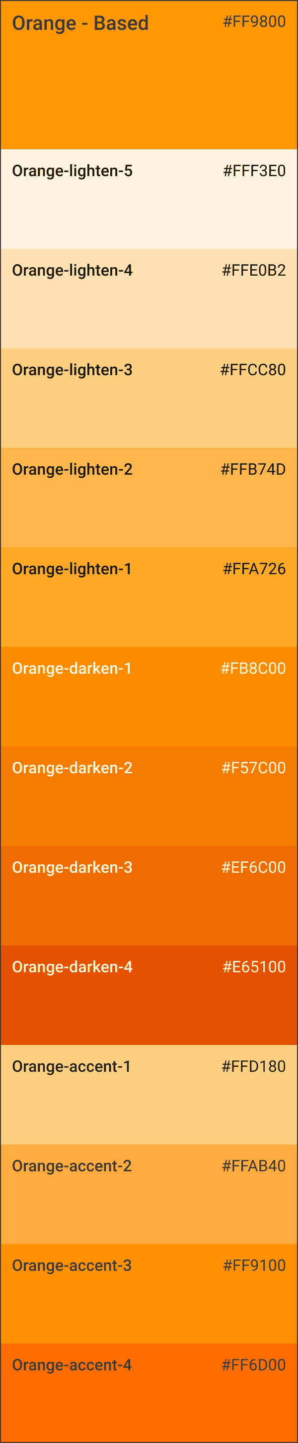
Colors
Primary Color Scheme
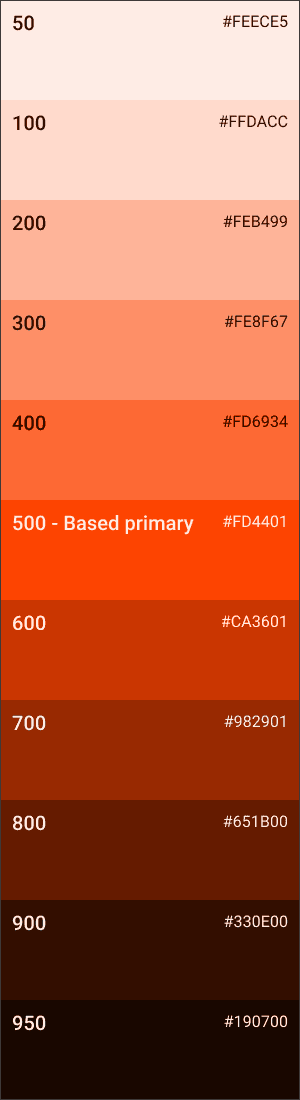
Tictag already has its own brand color. From this brand color, it will be used as an identity and I will apply it to the primary action in the application interface
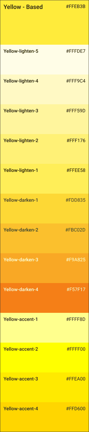
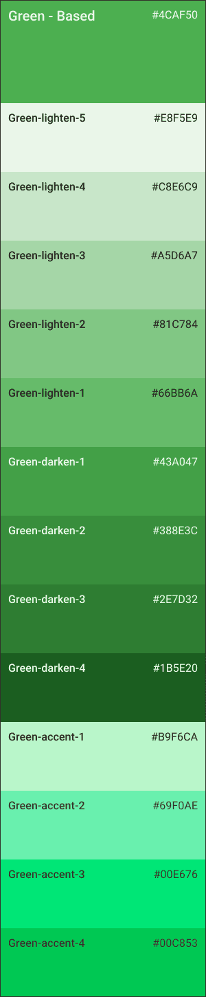
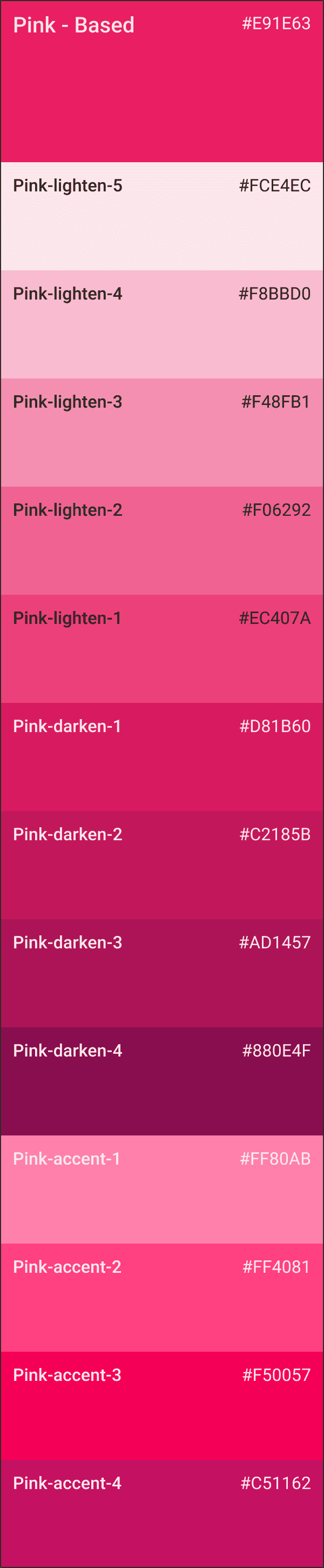
Semantic Color Scheme
For semantic color, I use Vuetify color generator library, this decision was taken based on a discussion with developer team that give a suggestion to use color generator instead of create it from scratch, for faster development later on.
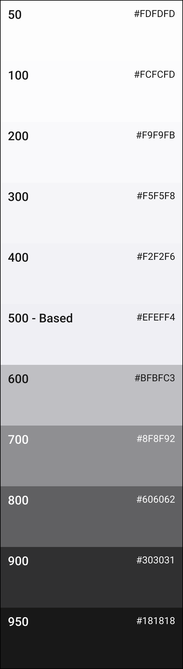
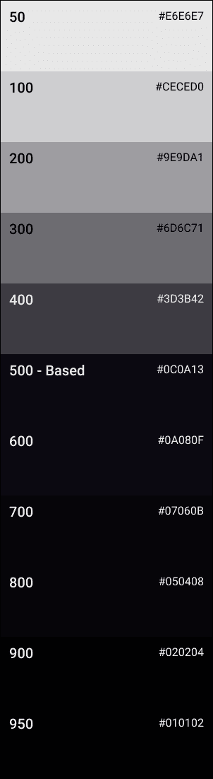
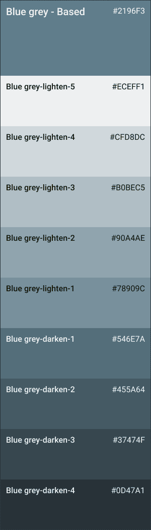
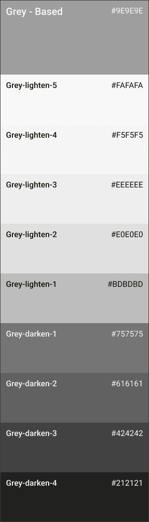
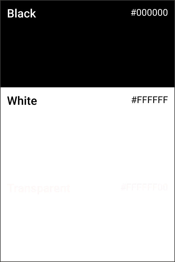
Neutral Color Shades
For semantic color, I use Vuetify color generator library, this decision was taken based on a discussion with developer team that give a suggestion to use color generator instead of create it from scratch, for faster development later on.
Color Token Mapping
Design tokens are named variables that store design-related values such as colors, typography, spacing, and more. They help bridge the gap between design and code by ensuring consistency across platforms and making UI updates more efficient. Why is design tokens important?
🔹 Scalability – Easily update styles across multiple platforms (Web, iOS, Android) without rewriting code.
🔹 Consistency – Ensures uniformity in UI components by using the same set of values.
🔹 Efficiency – Reduces redundant styling work and makes theme updates faster.
🔹 Cross-Platform Support – Works with CSS, JSON, SCSS, Tailwind, Swift, Android XML, and more.
Design tokens bridge design and development, ensuring a consistent, scalable, and efficient way to manage styles across platforms.
Design tokens should be applied in all aspects of design system to maintain the consistency
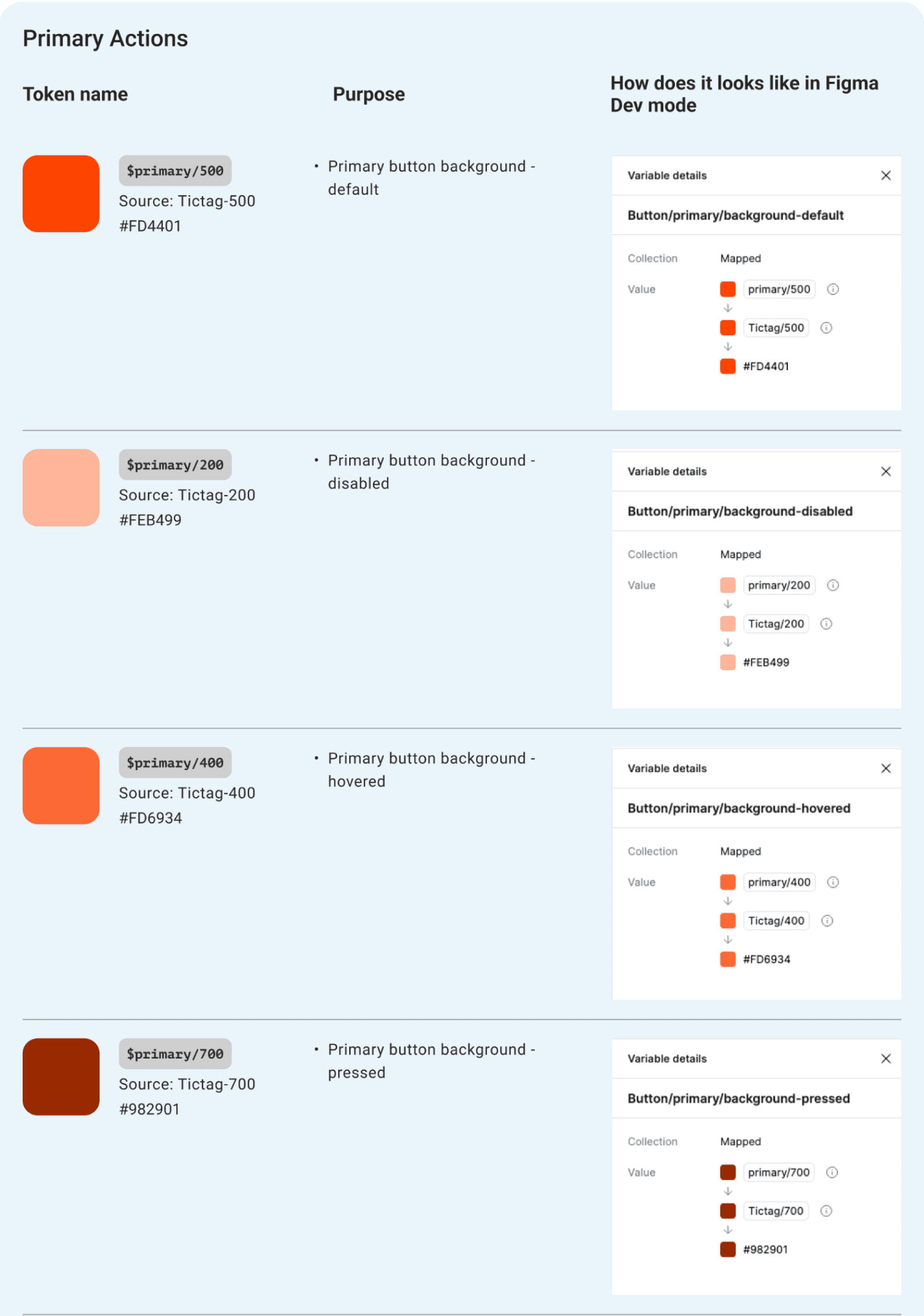
Bring it on to Figma Local Variable
In building a consistent and measurable design system, we have used the atomic design approach from the start. However, the implementation of atomic design did not go so well because when changing the color hex code, it did not have implications for the global assets.
But this problem can be solved when the Figma variable feature is released, because we can build from the smallest atom, which has not been given a specific name or for a specific role.
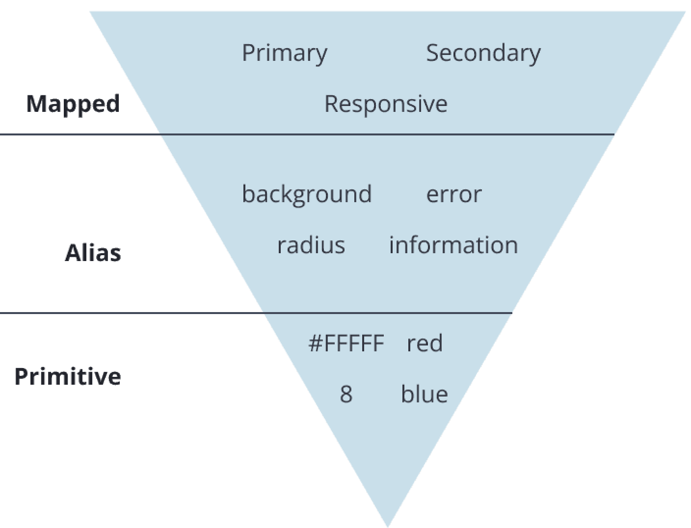
Primitive : All basic brand colors, numbers, etc, not assign a role, just pure hex code & number
Alias : It’s starting assign the purpose of each defining items
Mapped : Giving alias specific role
We took a systematic approach by grouping our variables into logical categories:
Color Variables : Primary, Secondary, Background, Border, State (Hover, Active, Disabled)
Spacing Variables : Small, Medium, Large
Typography Variables : Heading, Body, Caption, Button
Radius & Shadows : Standardized corner radii and elevation levels
By doing this, we ensured that every element in the UI referenced a variable instead of being hardcoded, making future updates effortless.
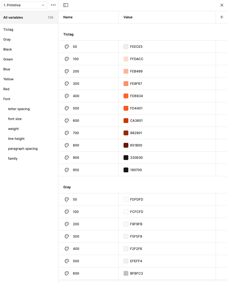
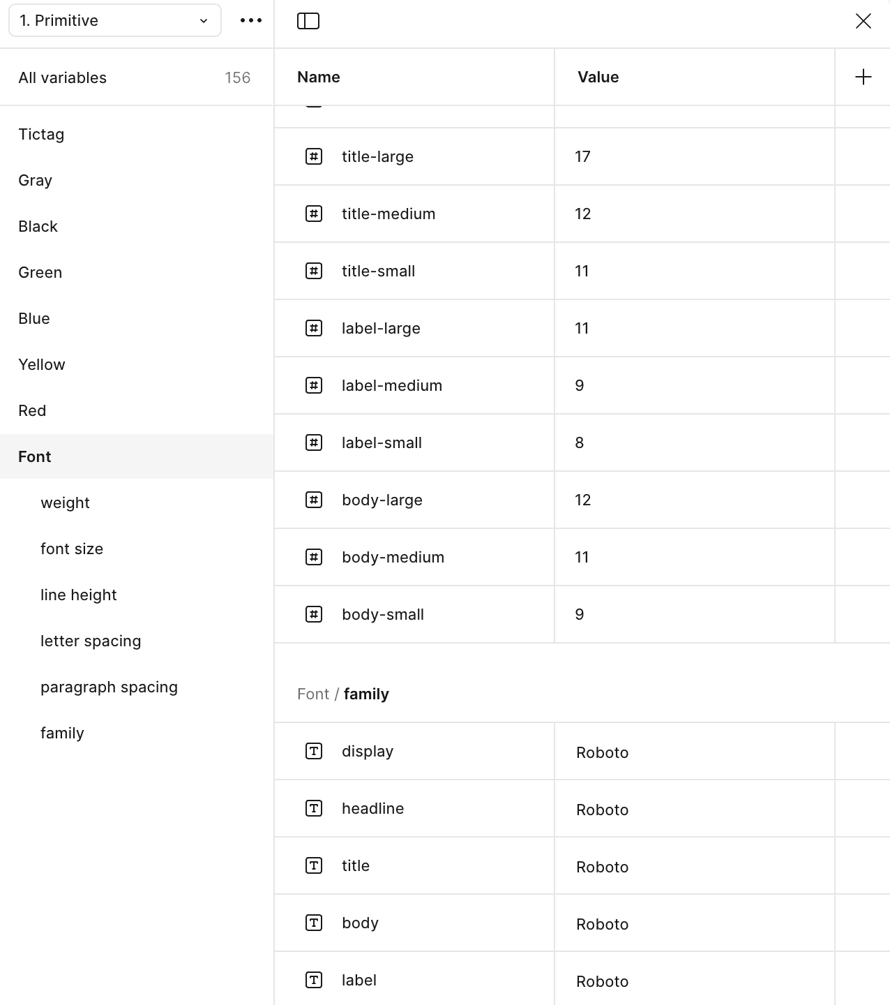
Primitive Level
Primitive variables are the core values of design system. They store raw, unlinked values such as colors, spacing, typography, and numbers.
At this primitive level, all kinds of colors, numbers used are in their original or raw form. We have not identified these colors for what specific task. As seen in the image on the side, there is only the color name and the color palette number.
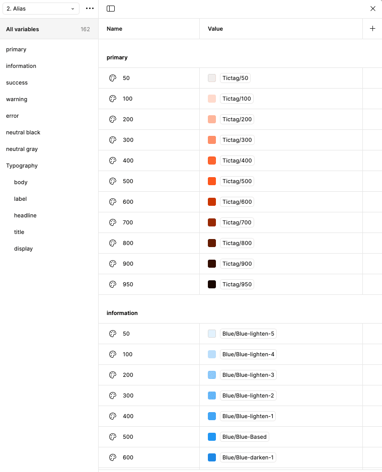
Alias Level
Alias variables are references to other variables instead of direct values. They allow to create contextual relationships between design elements.
Alias level is when the color is associated with a certain task. For example, here the color navy is the Primary color that will be used for the color of buttons, navigation, tabbing and so on. Likewise with other semantic colors such as red for error indicators, green for success indicators and so on.
To assign an alias, you can right click, then when the pop up menu appears select "Create alias".
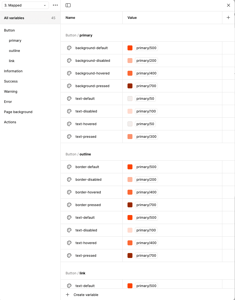
Mapped Level
Mapped variables allow you to switch variable values based on different modes (e.g., Text colors, background, icon, etc).
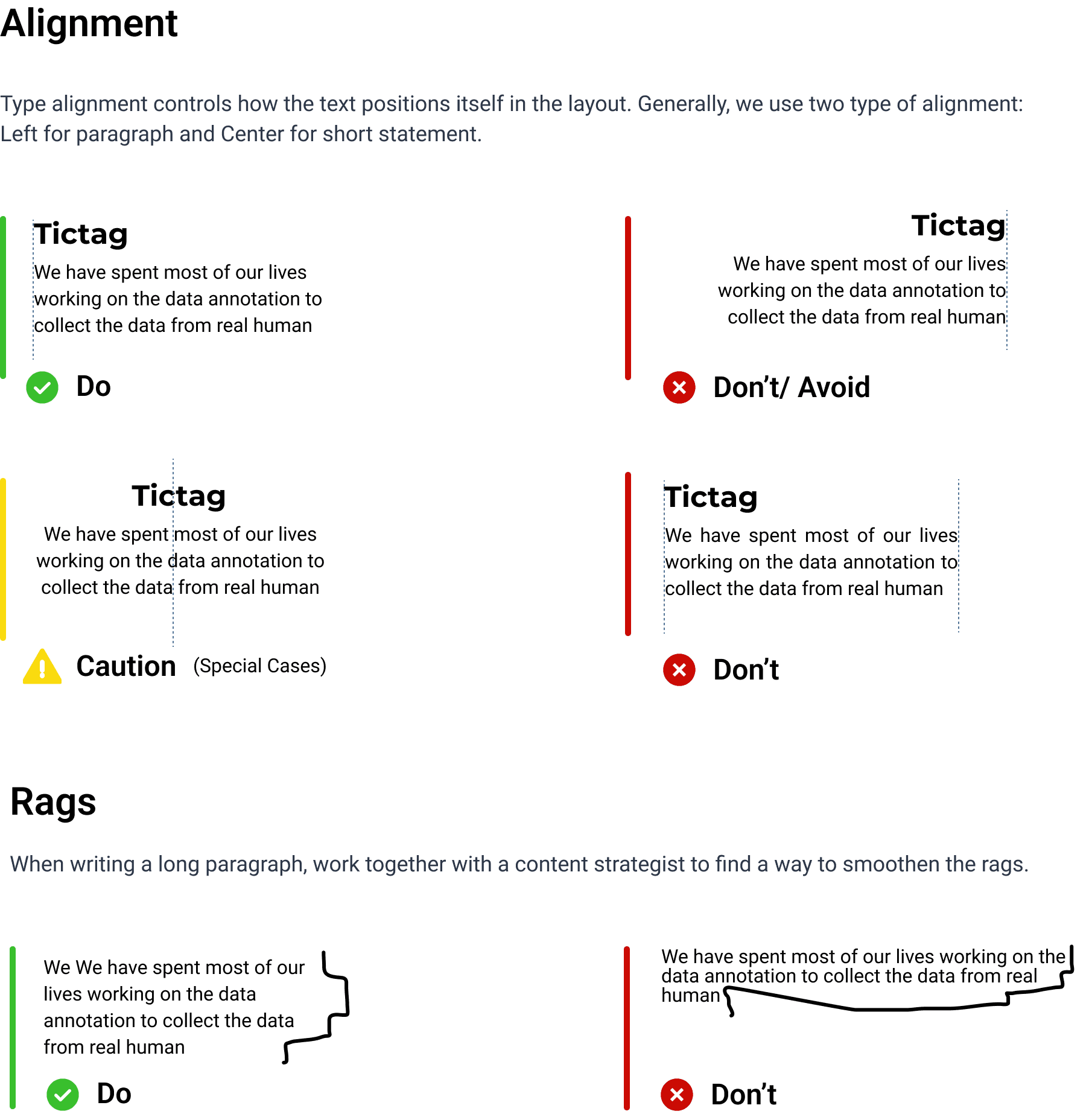
Typography
Roboto Family
I choose Roboto font family, because it was an instruction from PM, for faster development process just use the font by Google Material 3. Because the design system should be consider to use Material 3 components and tweak it little bit.

Typography properties
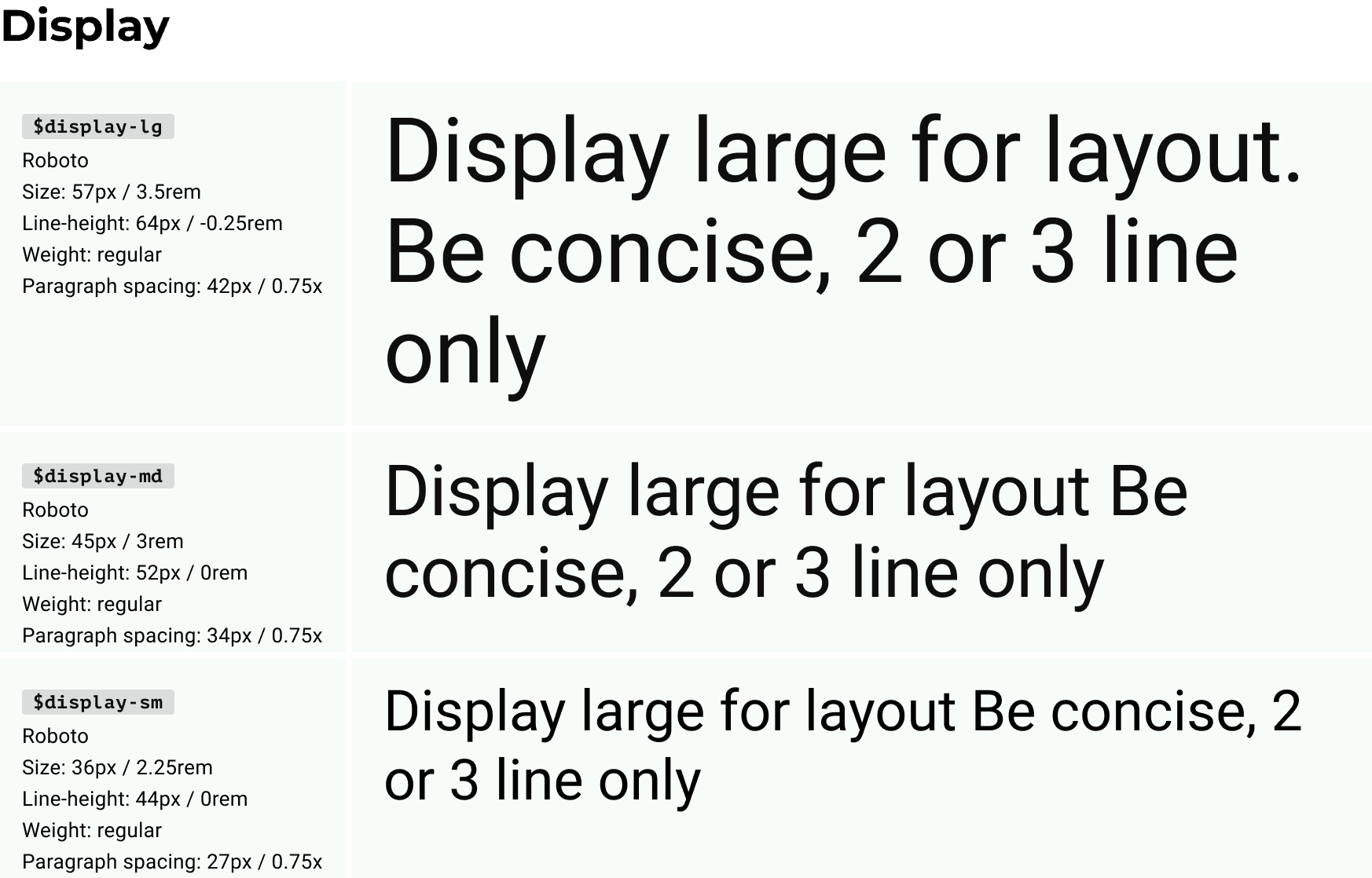

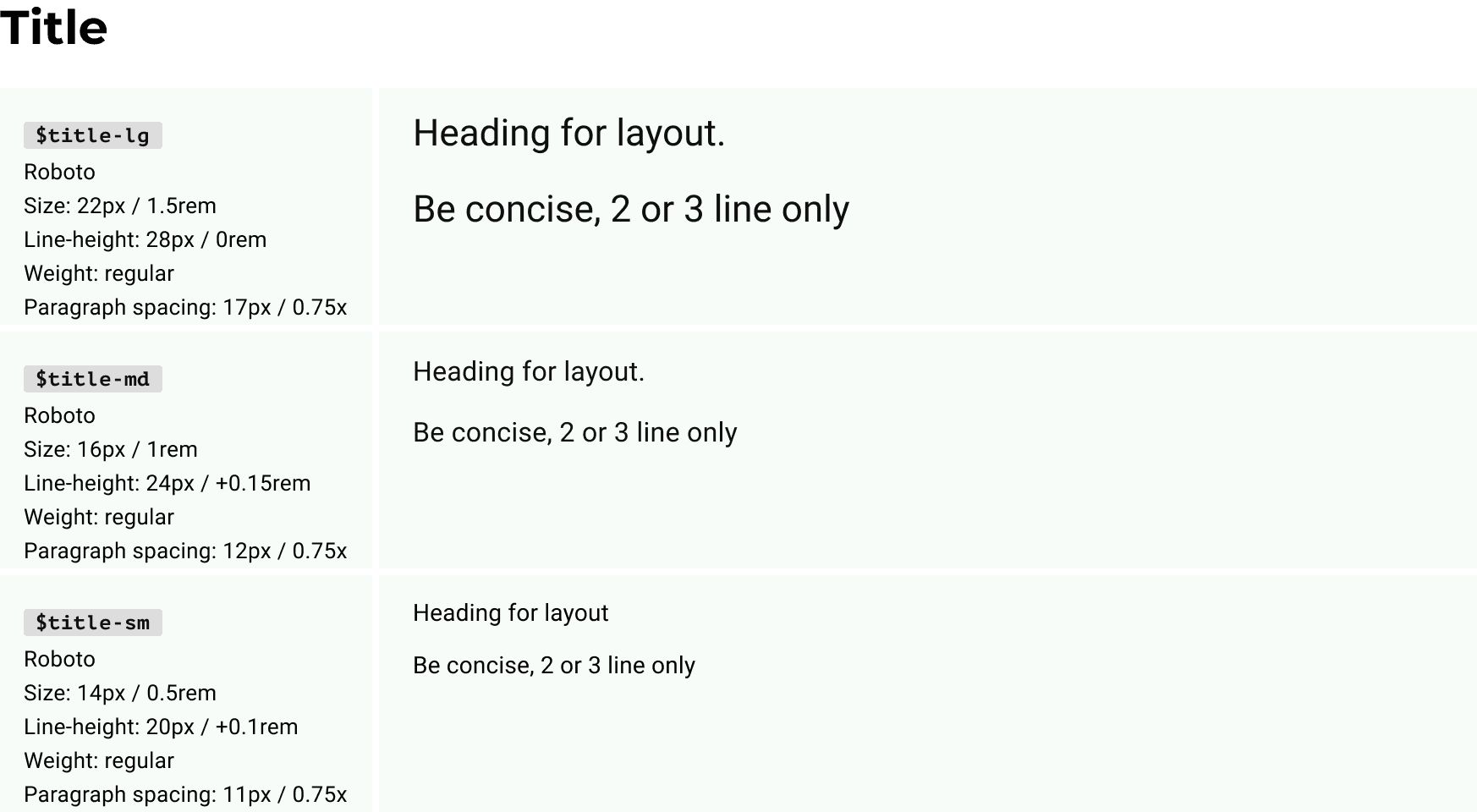
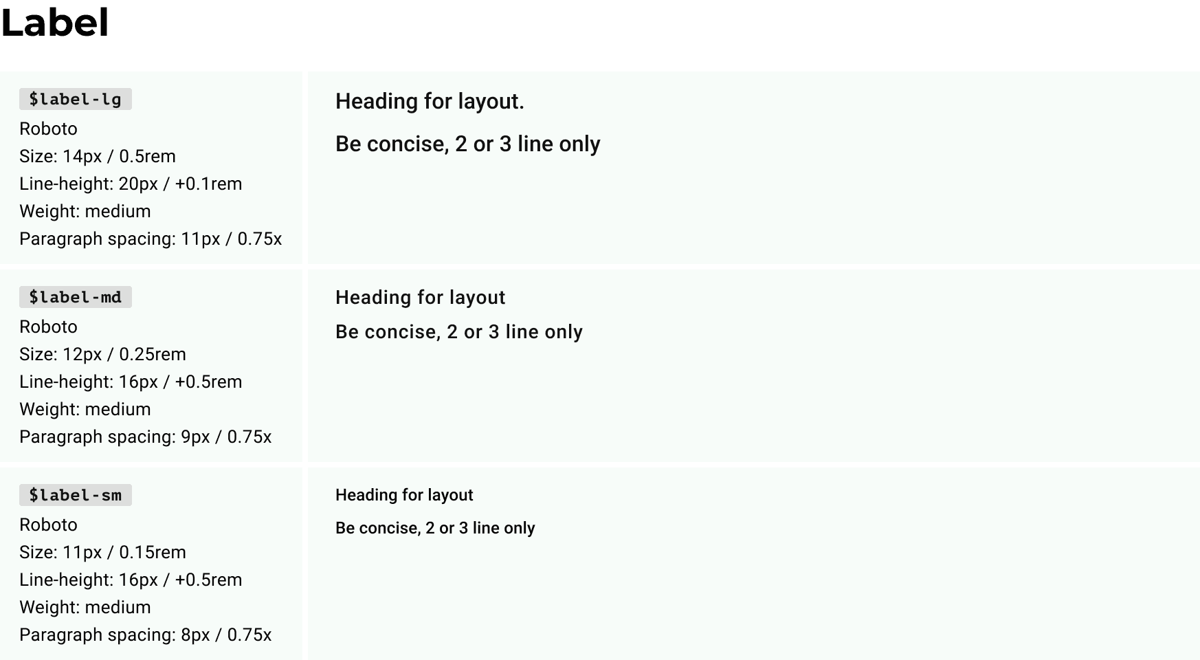
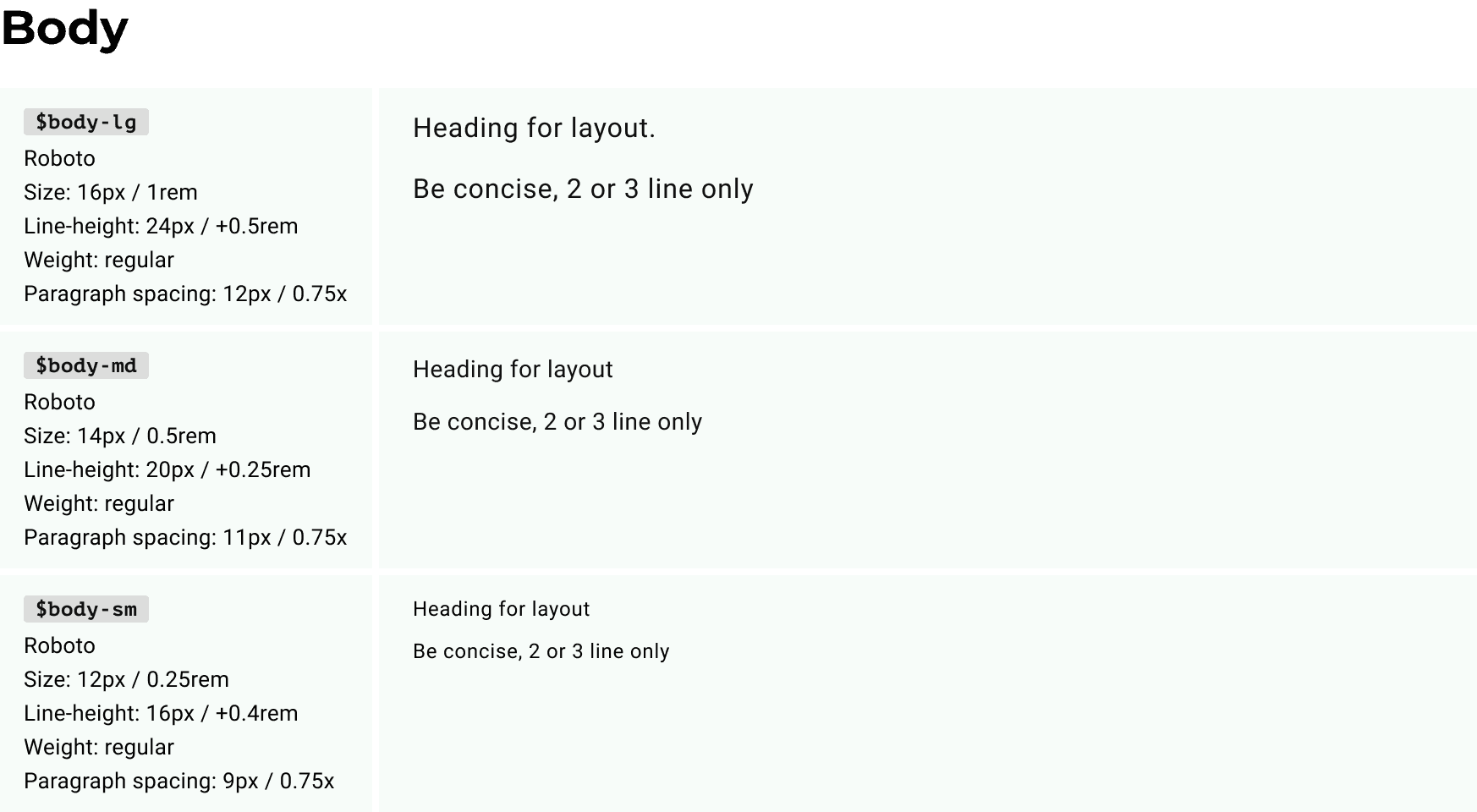
Typography tokens
Guidelines

Bring it on to Figma Local Variable
In building a consistent and measurable design system, we have used the atomic design approach from the start. However, the implementation of atomic design did not go so well because when changing the font properties, it did not have implications for the global assets.
But this problem can be solved when the Figma variable feature is released, because we can build from the smallest atom, which has not been given a specific name or for a specific role.
Primitive Level
Primitive variables are the core values of design system. They store raw, unlinked values such as text spacing, typography, font weight, and numbers.

Alias Level
Alias variables are references to other variables instead of direct values. They allow to create contextual relationships between design elements.
Alias level is when the type style is associated with a certain task.
Typography doesn’t have a complex structure like colors, so we only need 2 levels of tokens instead of 3 just like colors.
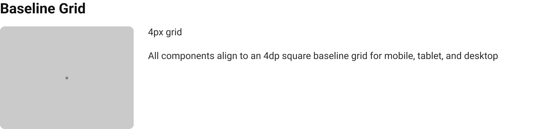
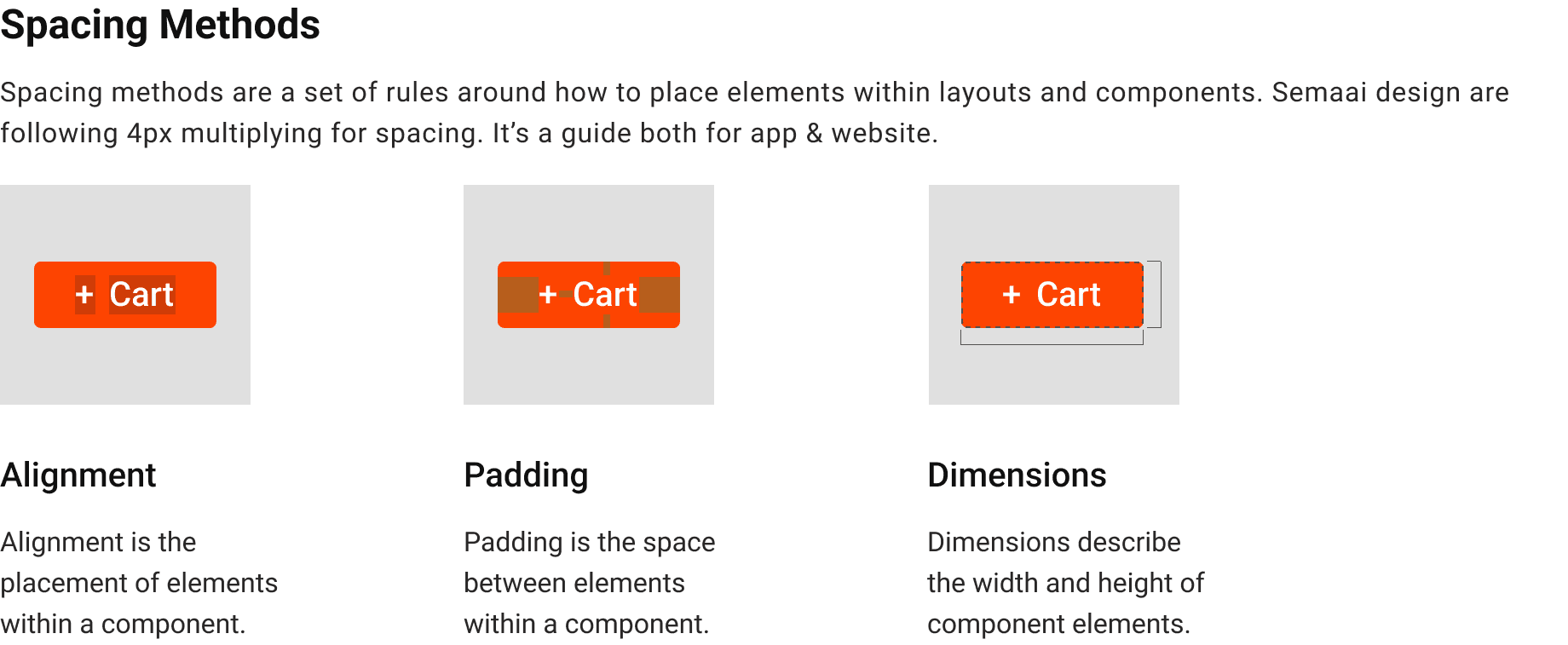
Scaling / Spacing Values
Scaling or Spacing methods use baseline grids, keylines, padding, and incremental spacing to adjust ratios, containers, and touch targets.

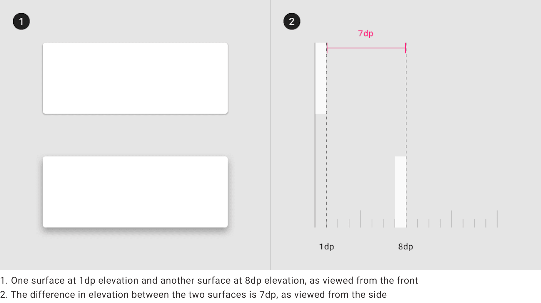
Elevation
Elevation in Material Design is measured as the distance between Material surfaces. The distance from the front of one Material surface to the front of another is measured along the z-axis in density-independent pixels (dps) and depicted (by default) using shadows.

Design Process 2: Build Design Components
Button Components & Variants


Input Text Field Components & Variants
Checkboxes Components & Variants

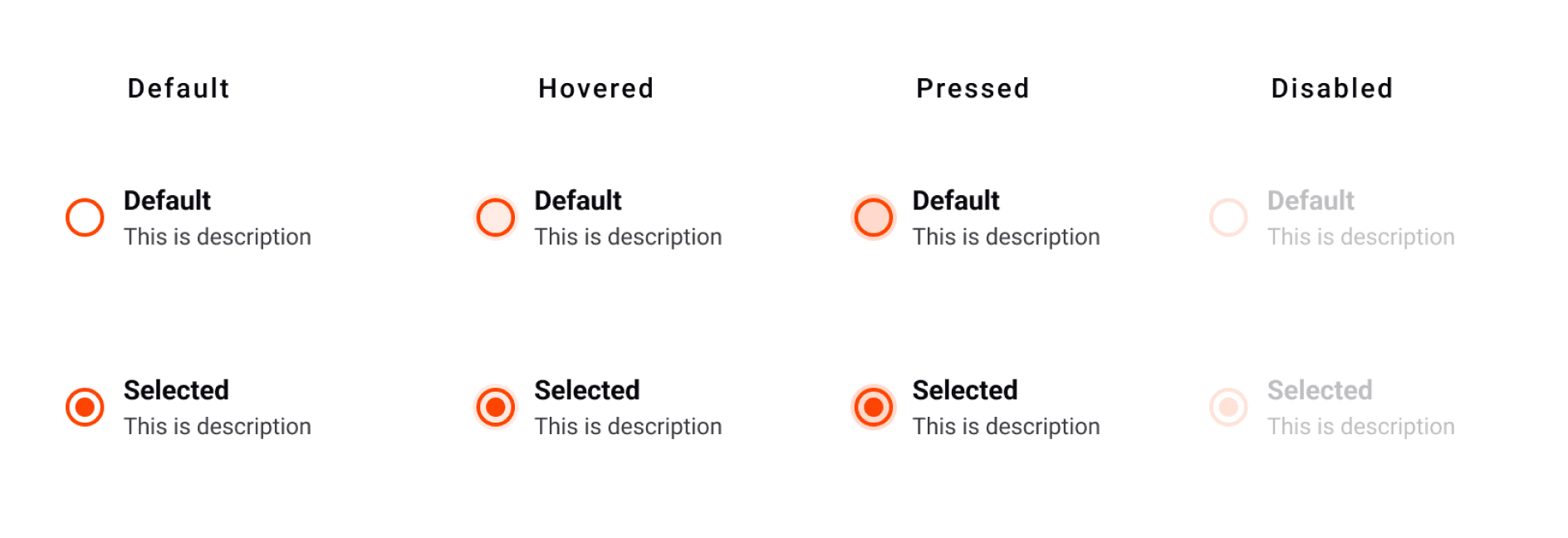
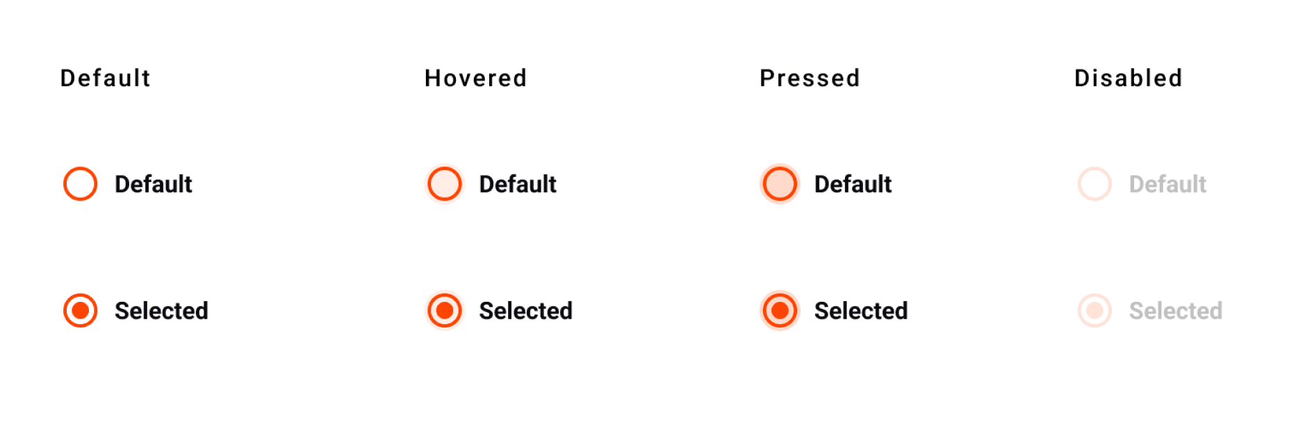
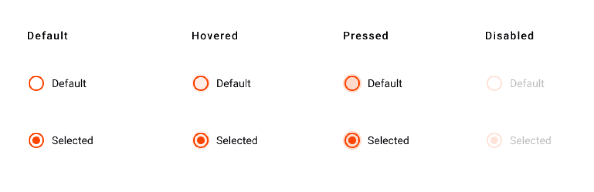
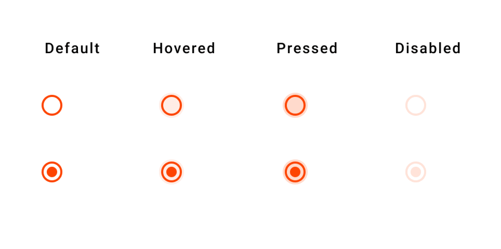
Radio Button Components & Variants
Switch Components & Variants


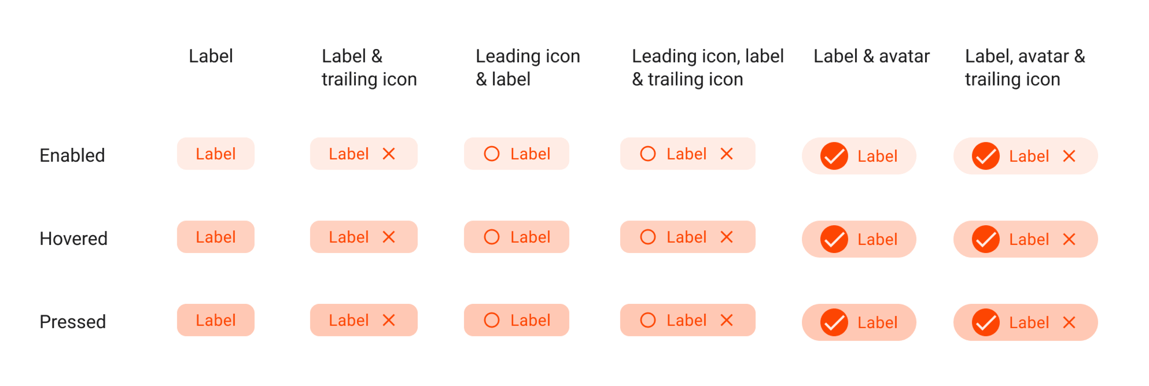
Chips Components & Variants
Accordion Components & Variants
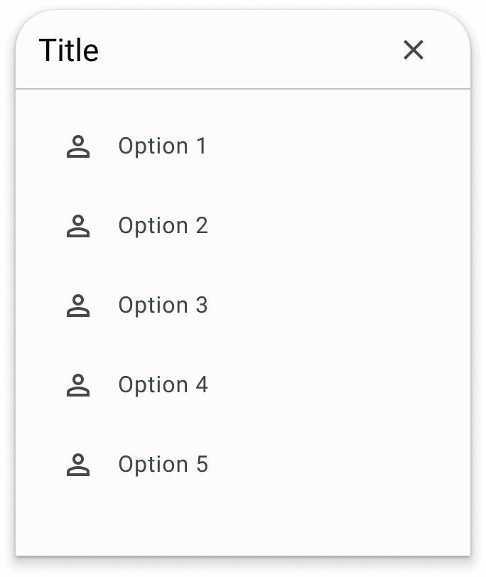
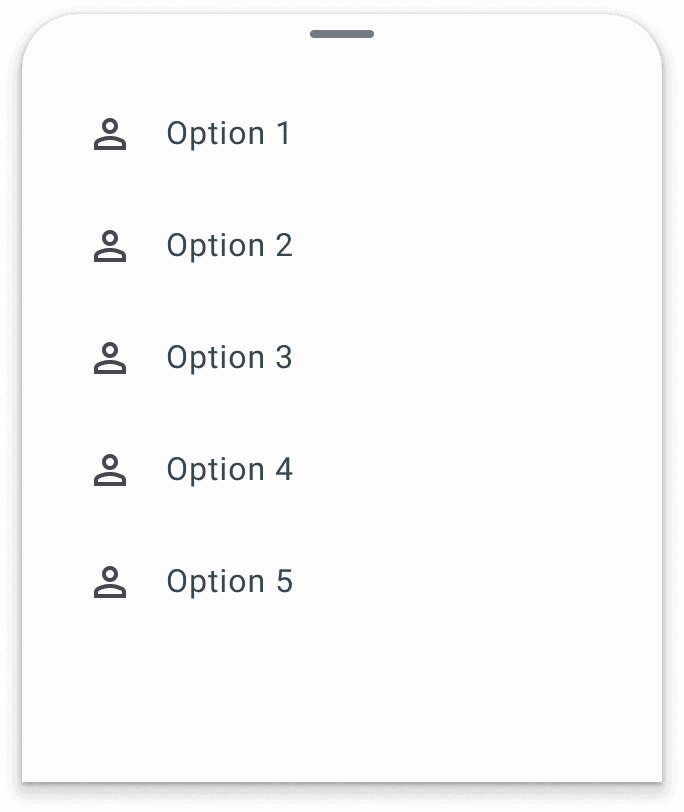
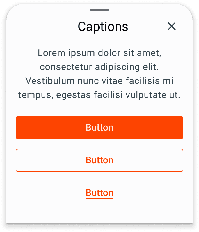
Bottom Sheet Components & Variants
Bottom sheet is likely to have many use cases when I discuss and confirm with related stakeholders. So the interface for the bottom sheet must also accommodate this need so that it produces quite a lot of interface variations.


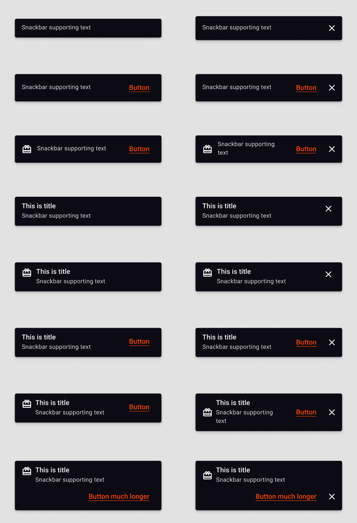
Snackbar Components & Variants


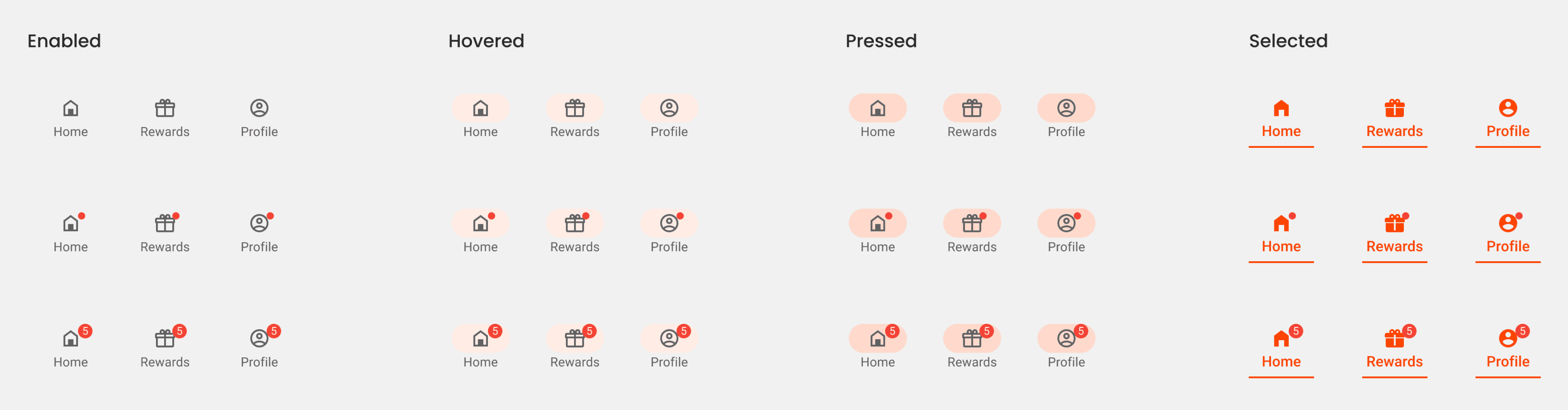
Bottom Navigation Components & Variants

Here are some setup documentation that I made for system design documentation. Setup documentation is like a manual document for implementation.
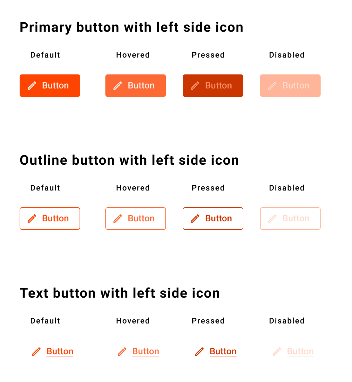
Button Components
Buttons help people take actions, such as sending an email, sharing a document, or liking a comment. Each screen should contain a single prominent button for the primary action. This high-emphasis button commands the most attention. The arrangement of on-screen elements should clearly communicate that other buttons are less important.
Specs
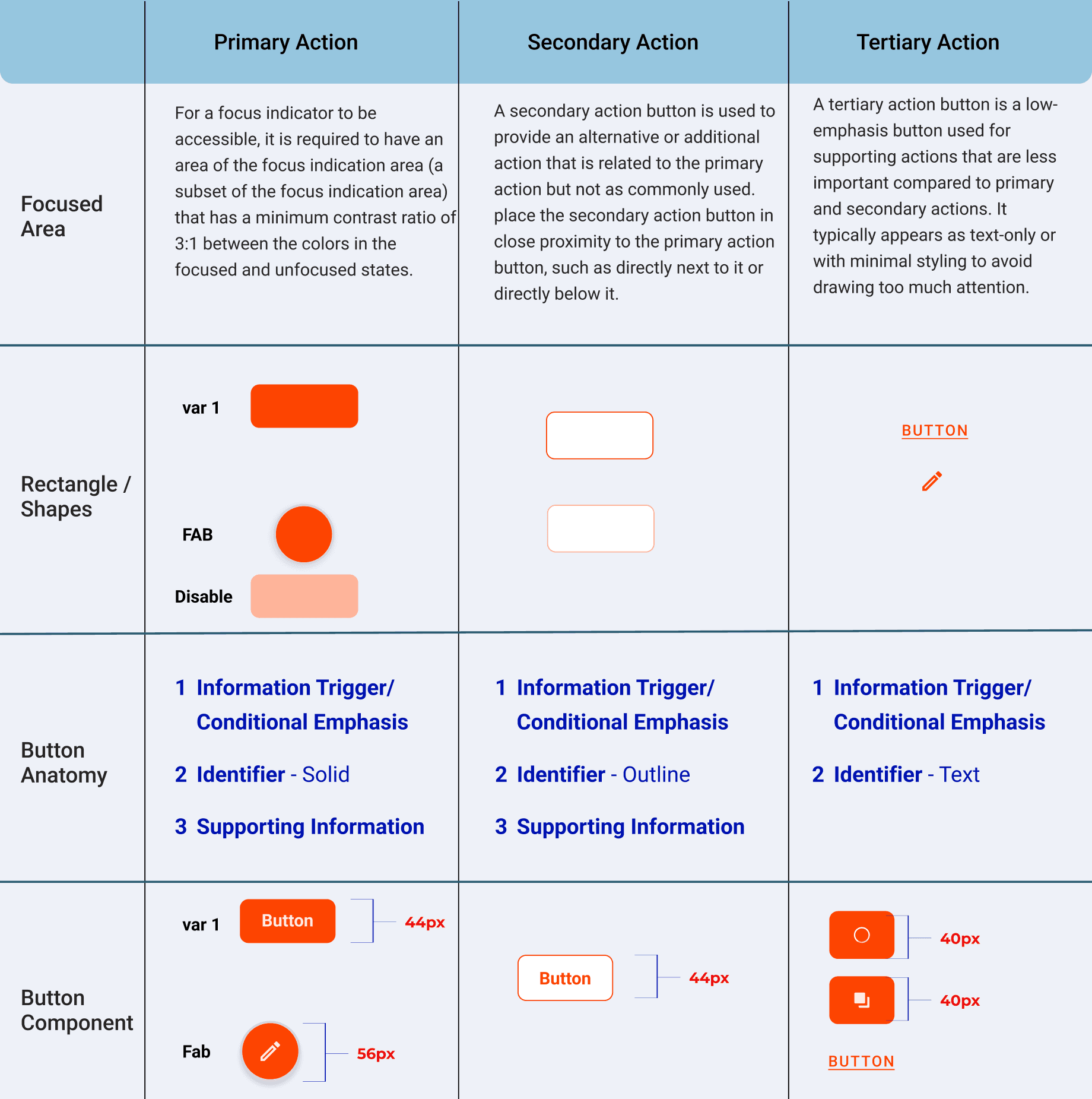
In addition to creating button variations and specifications, I also wrote down rules of thumbs and do's & don'ts. This is important because in using buttons, there are certain rules that must be understood, and this is also to make documentation easier for new designers who will join in the future.
Do’s and Dont’s

When using multiple buttons, you can place an outlined button (medium emphasis) next to a filled button (high emphasis).
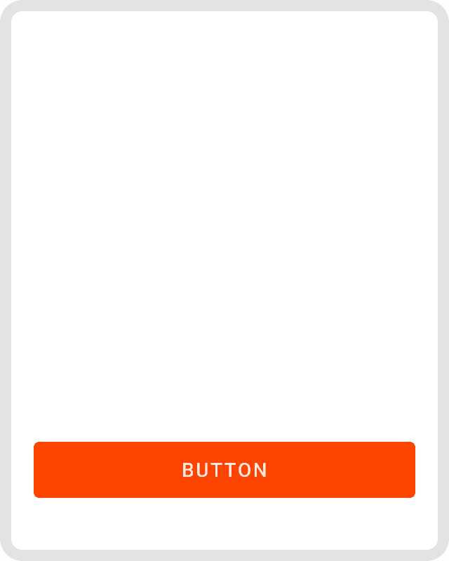
Use a filled button on its own for a single important action.
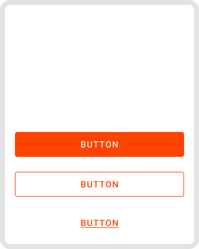
Maintain Visual Hierarchy – Differentiate between primary, secondary, and tertiary buttons using color, size, or styling.
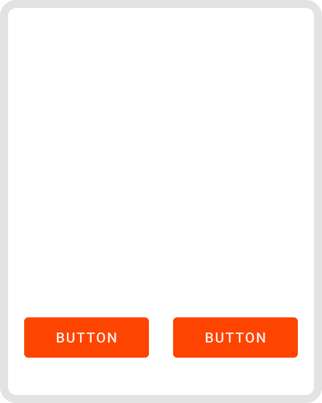
Don’t overuse primary button in one page
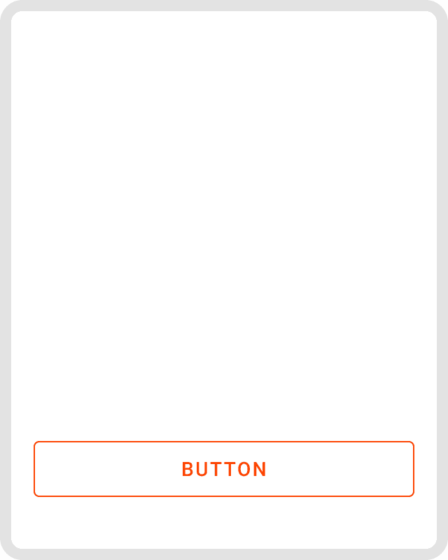
Don’t use more than 1 primary CTA in one page
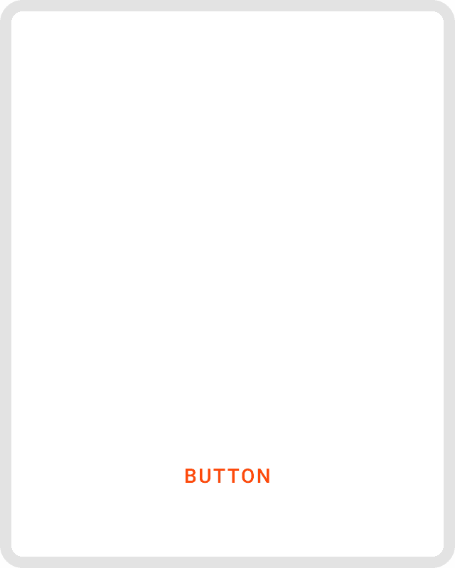
Don't Rely Solely on Color – Use underlined alongside color to differentiate button states for color-blind users.
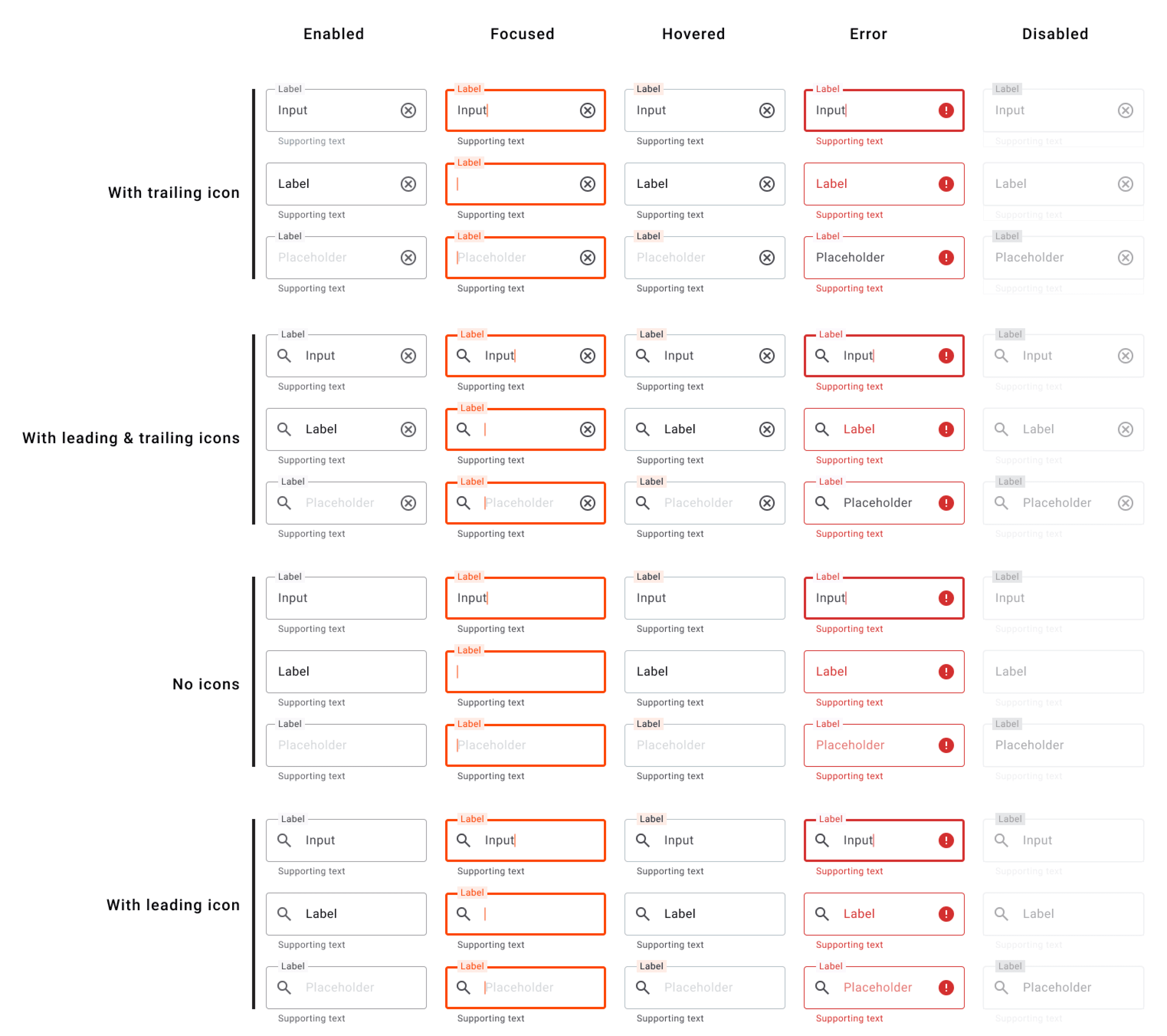
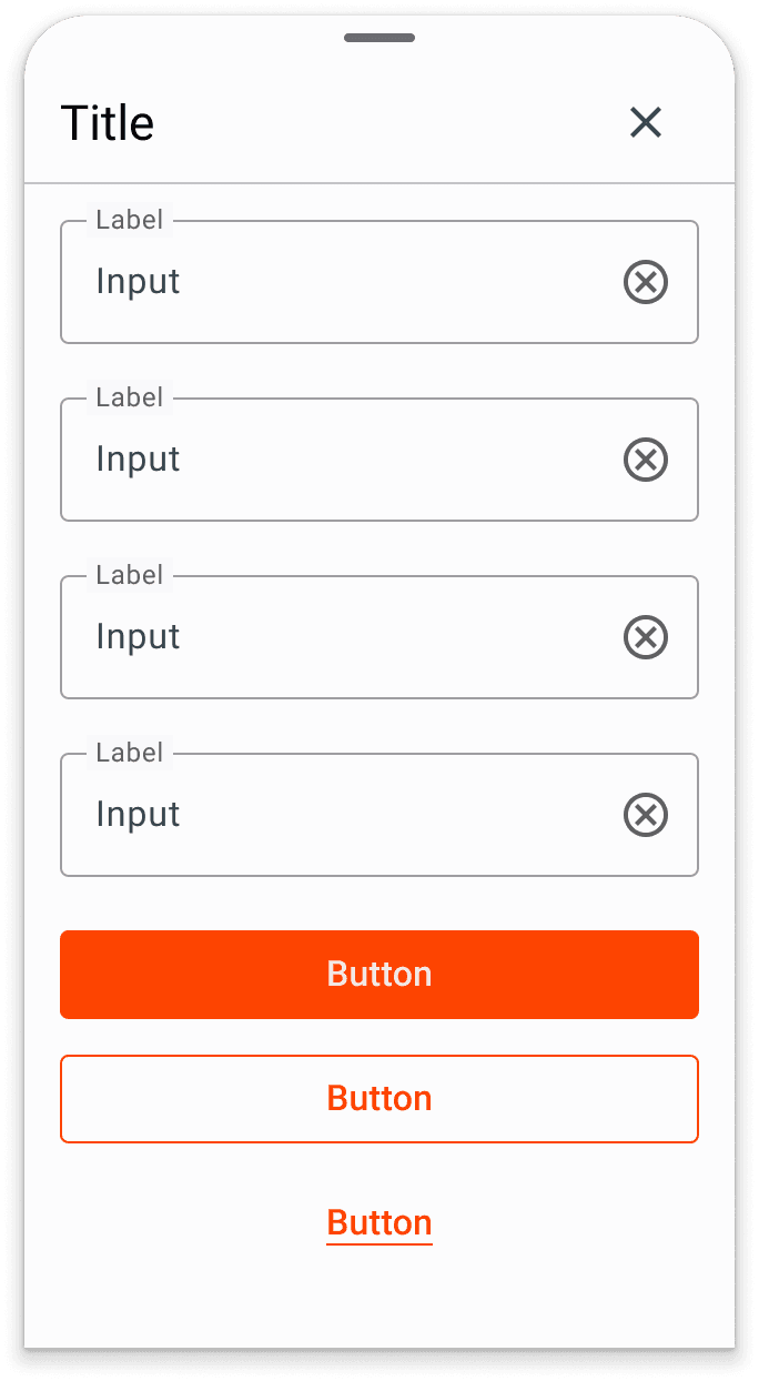
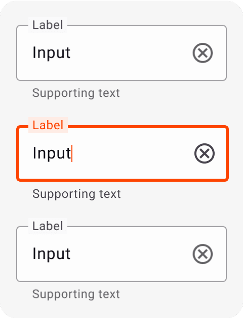
Input Text Fields

5
6
1
2
3
4
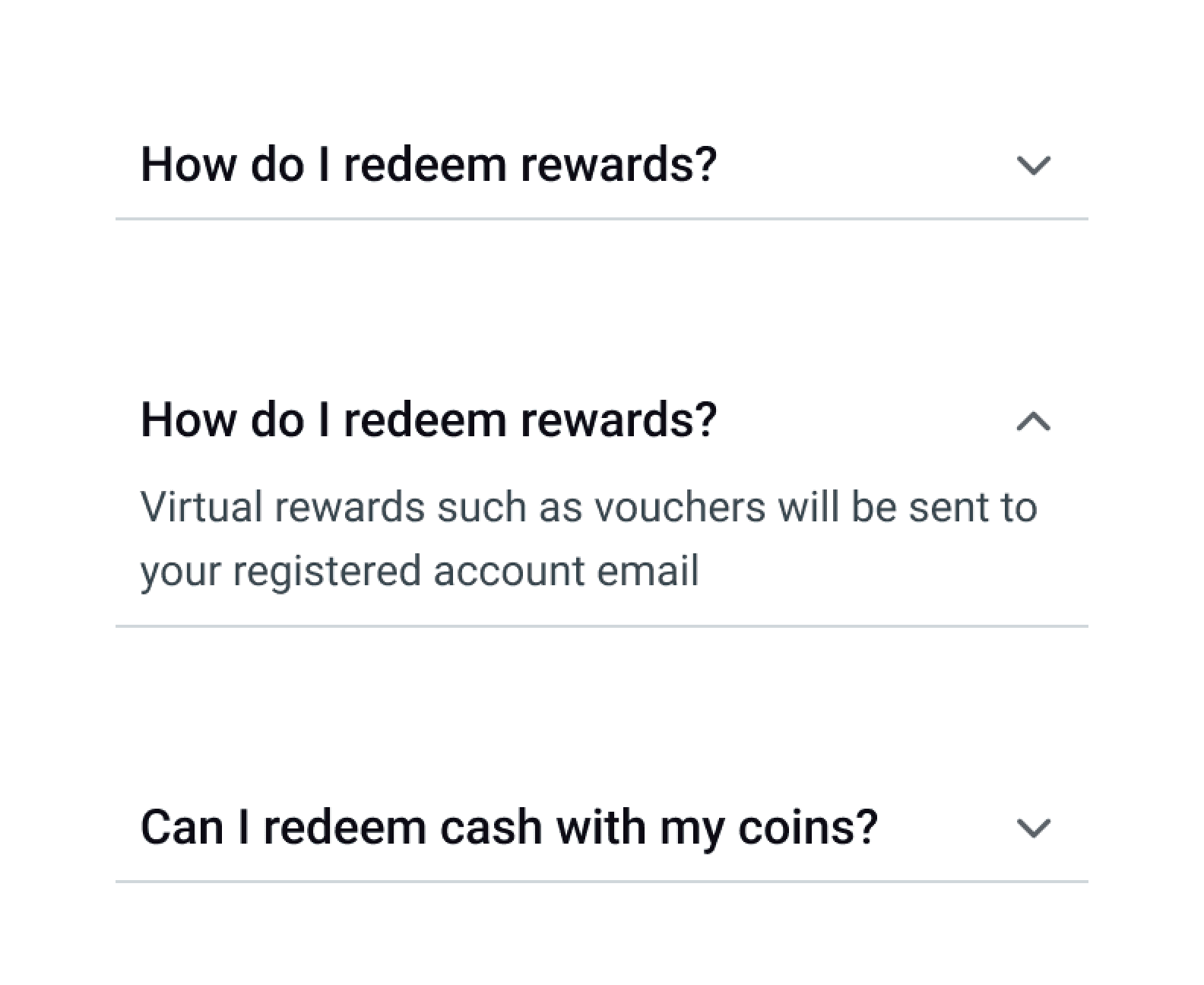
1 Container
2 Leading icon (optional)
3 Label title
4 Label text
5 Trailing icon (optional)
6 Supporting text (optional)
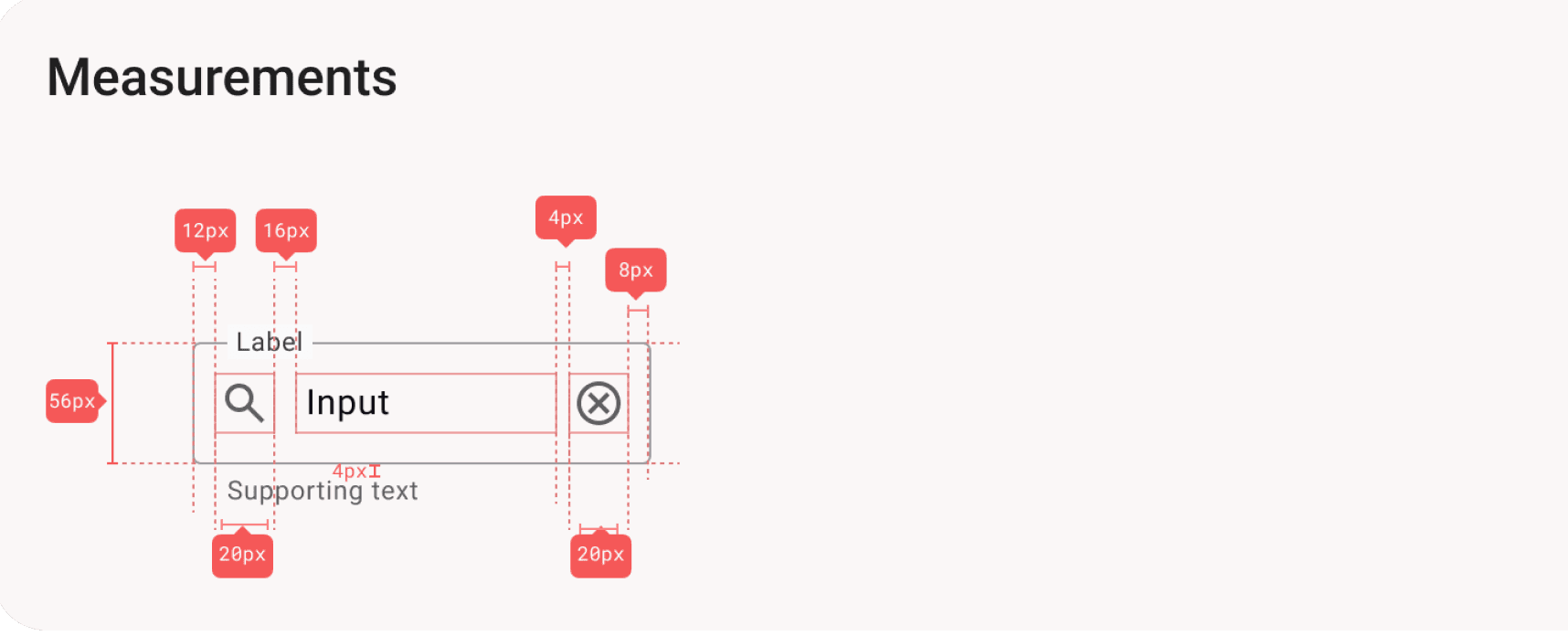
Specs & Anatomy

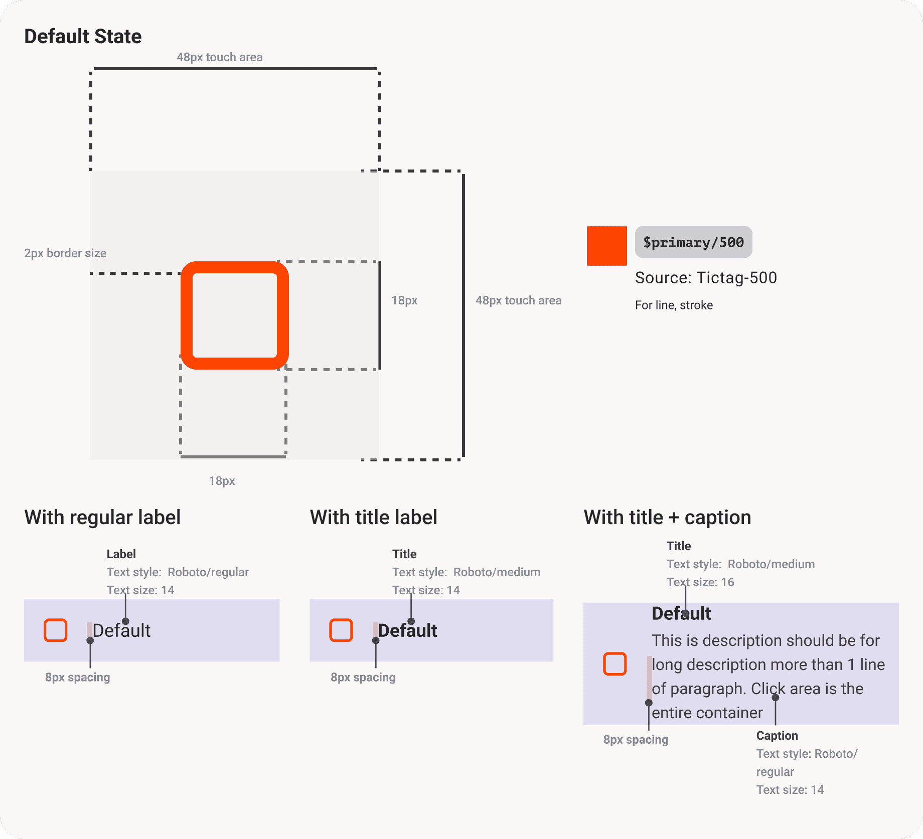
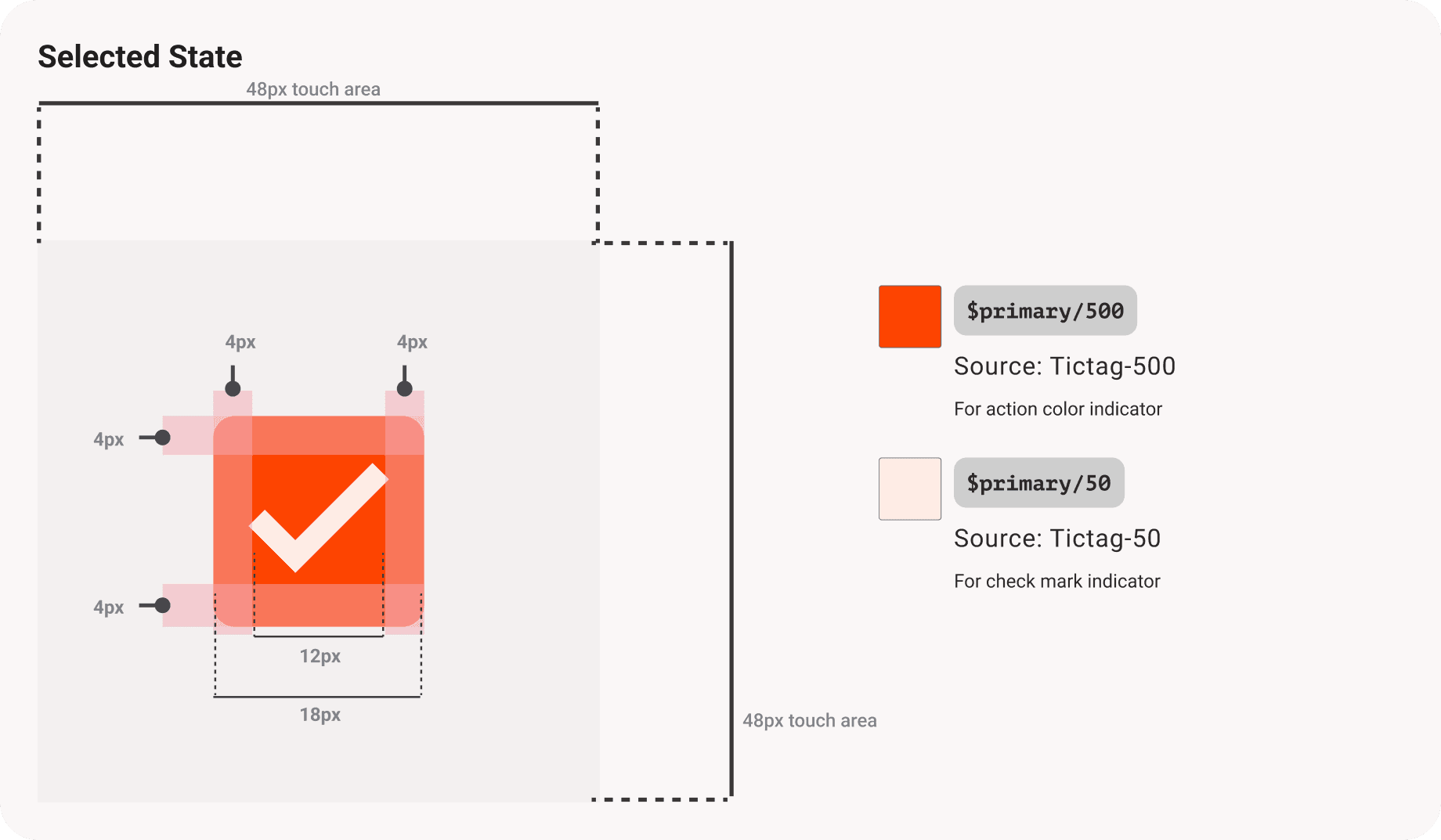
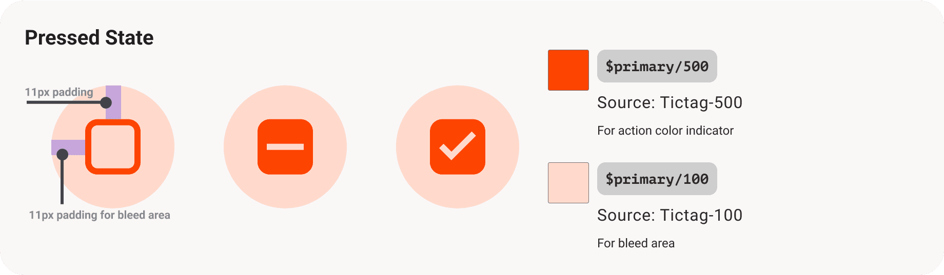
Defining the anatomy of checkboxes and their variations, so that implementation in the development process is more actual.
Guidelines
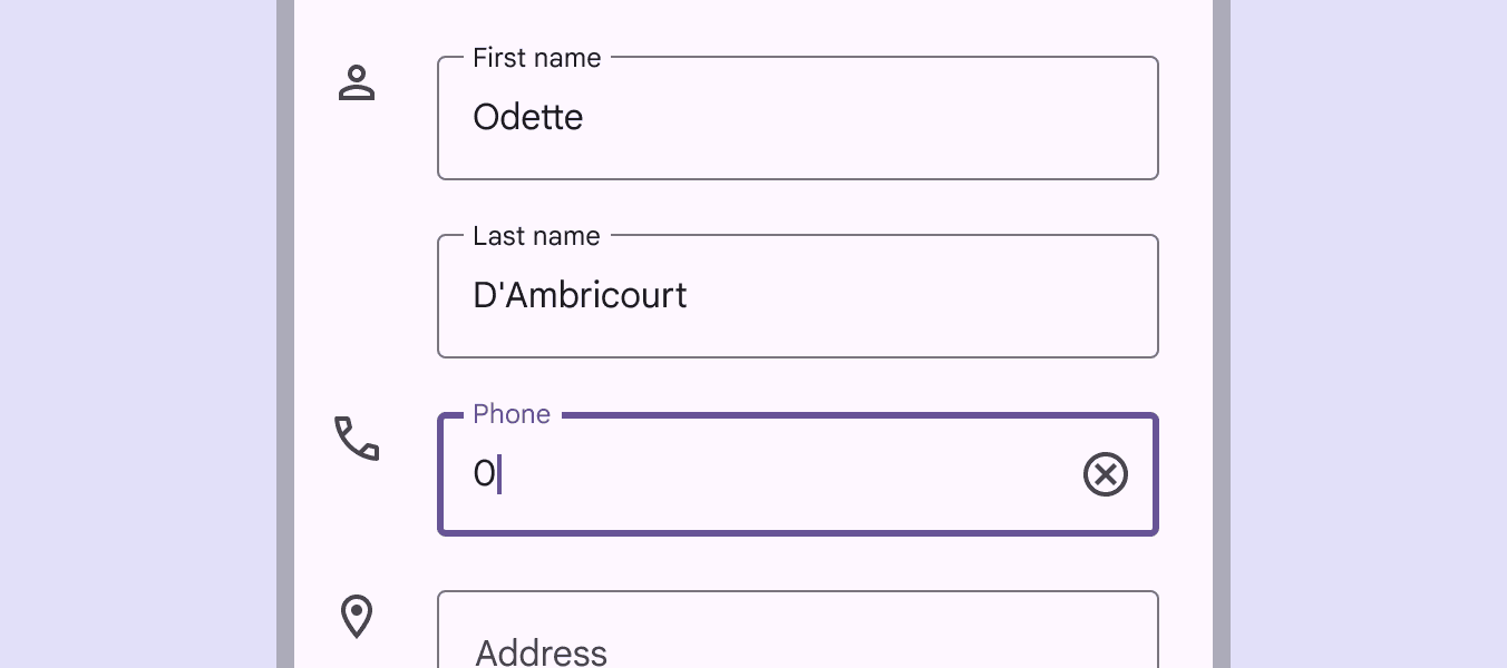
Use a text field when someone needs to enter text into a UI, such as filling in contact or payment information.
Containers

Label
Label text informs users about what information is requested for a text field. Every text field should have a label.
Label text should be aligned with the input text, and always visible.
Label text shouldn't be truncated or take up multiple lines. Keep it short, clear, and fully visible.
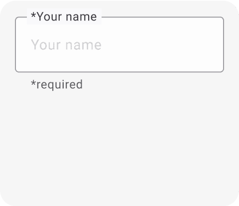
Required Text Indicator
To indicate that a field is required, display an asterisk (*) next to the label text and mention in supporting text that the asterisks indicate required fields.
If some fields are required, indicate all required ones
If most fields are required, indicate optional fields by displaying the word “optional” in parentheses next to the label text
If required text has a particular color, that color should also be used for the asterisk

Input text
Input text is text the user has entered into a text field.
Text fields can display user input text in the following ways:
Single line text fields display only one line of text
Multi-line text fields grow to accommodate multiple lines of text
Text areas are fixed-height fields
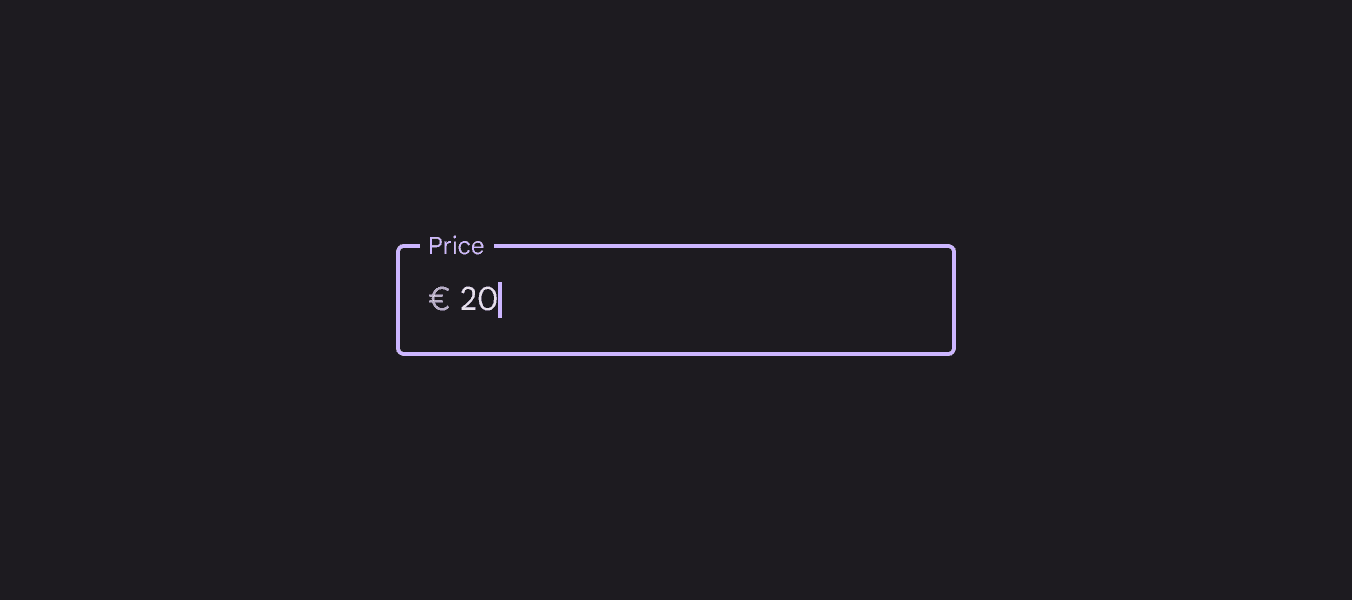
Prefix text
Text fields can contain prefix text such as currency symbol.
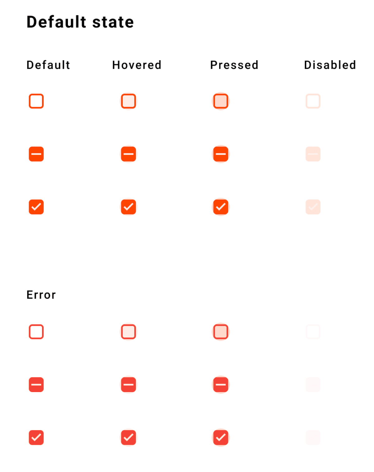
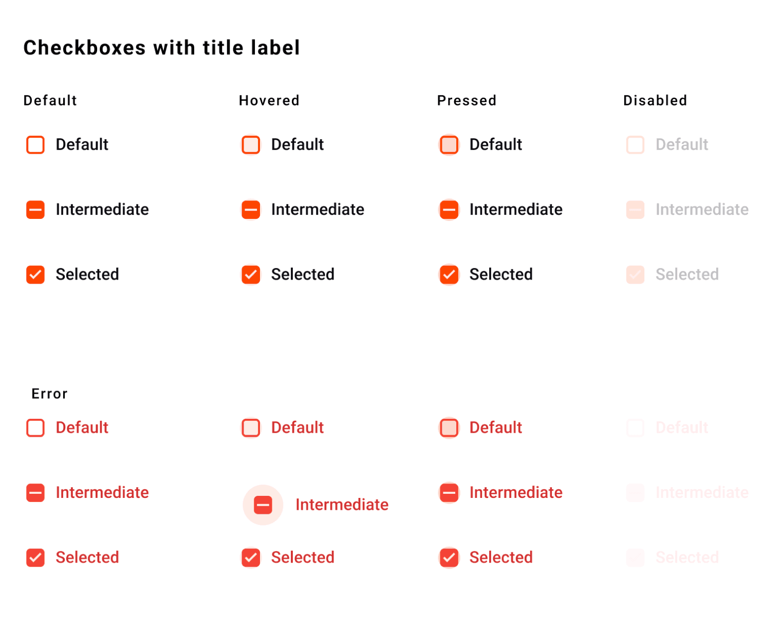
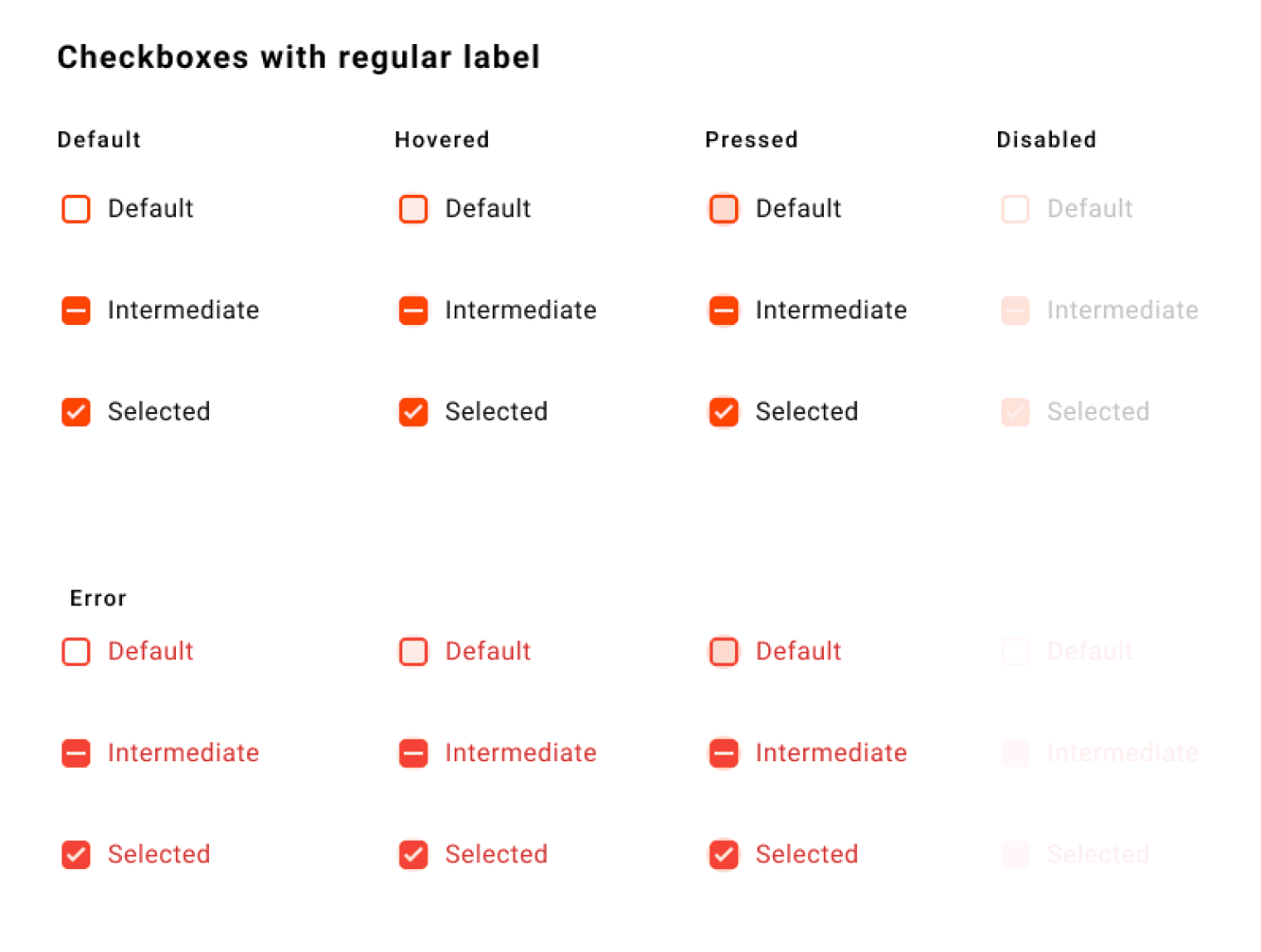
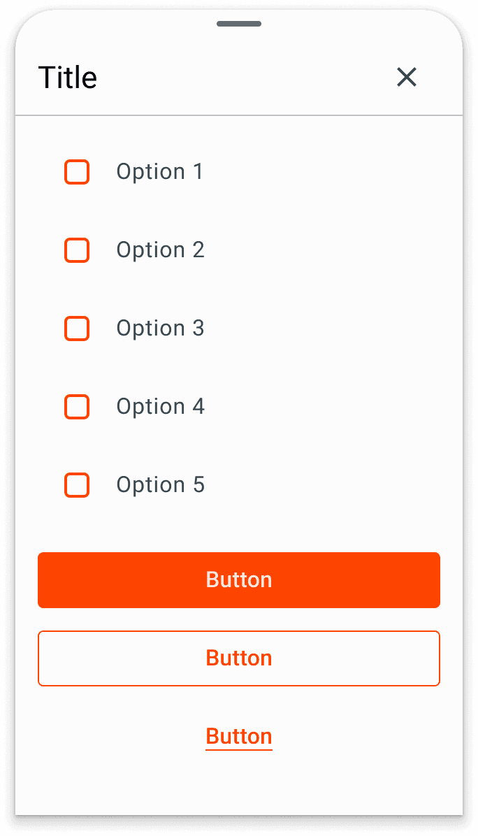
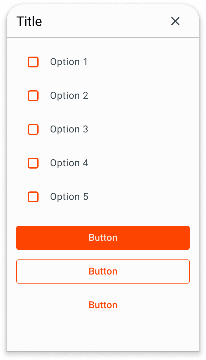
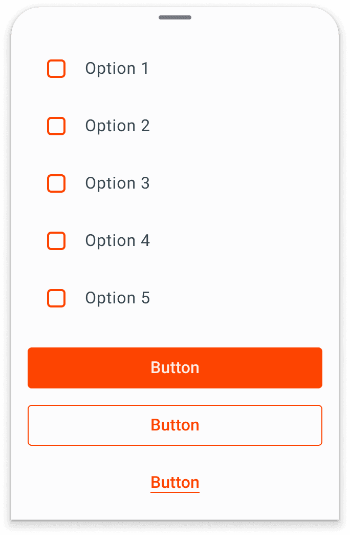
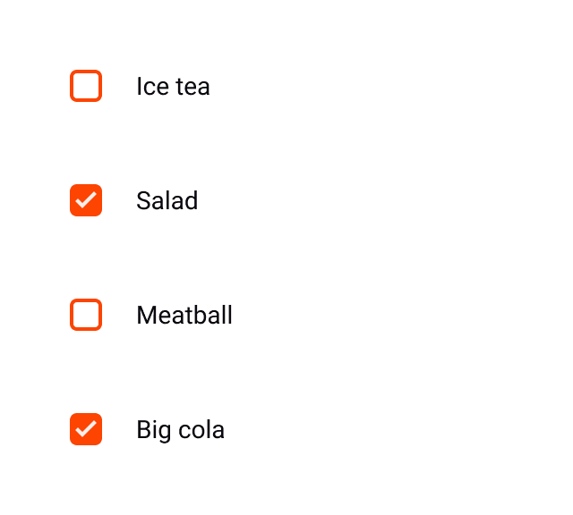
Checkboxes Components
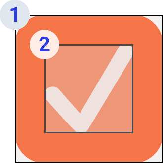
1 Identifier
Shape that acts as container and visual cues, meant to attract attention. Gives ability to user in seeing the main information in the first place.
2 Supporting Identifier
Icon that is meant to inform users about changes in the expected option. Next information users rely on to ensure the identifier interacts as expected.
Use checkboxes to:
Select one or more options from a list
Present a list containing sub-selections
Turn an item on or off in a desktop environment
Visually group similar options together
Specs & Anatomy
Defining the anatomy of checkboxes and their variations, so that implementation in the development process is more actual.


Guidelines
Use checkboxes to:
Select one or more options from a list
Present a list containing sub-selections
Turn an item on or off in a desktop environment
Visually group similar options together
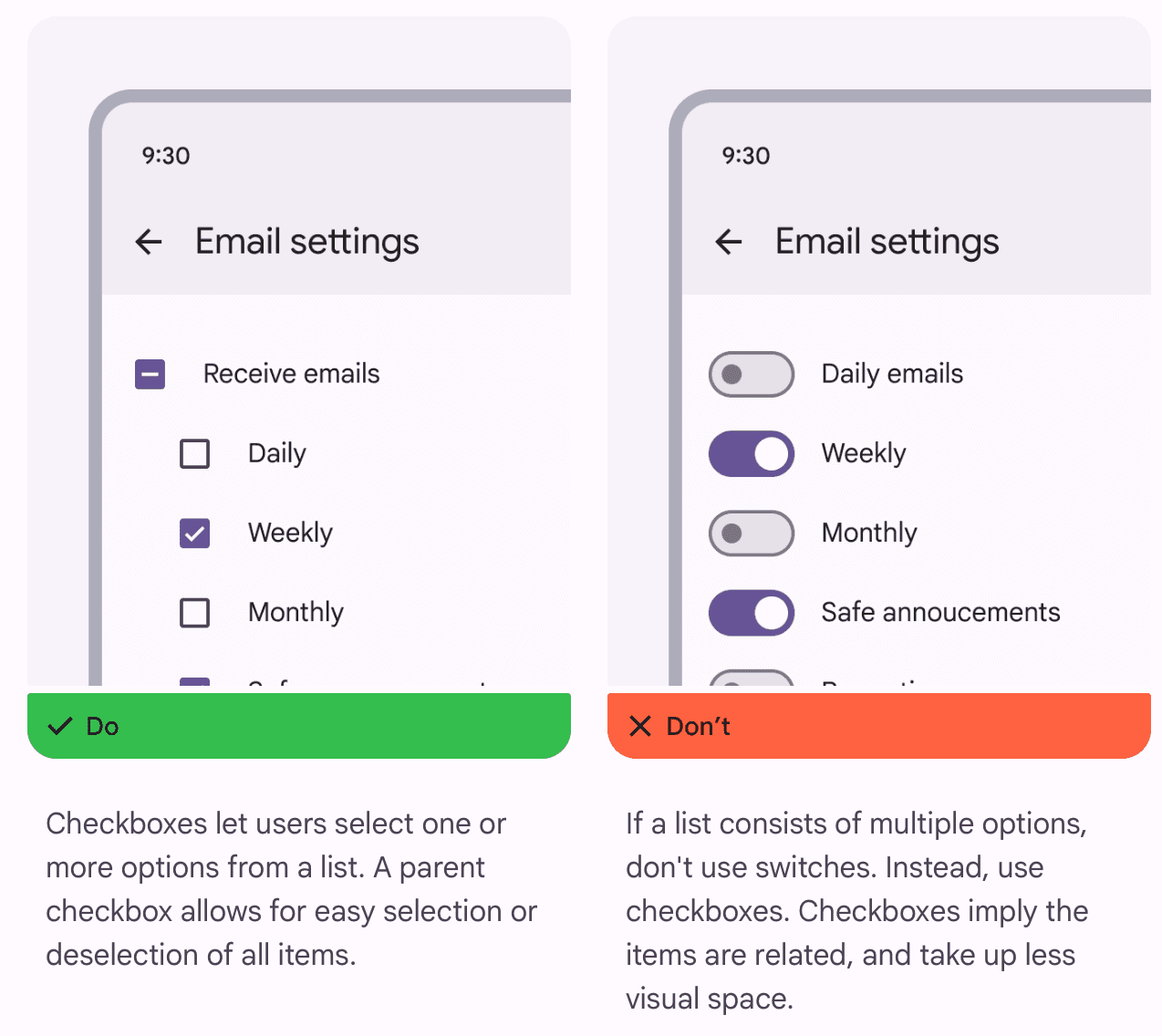
Checkboxes should be used instead of switches if multiple, related options can be selected from a list. Checkboxes visually group similar items effectively and take up less space than switches.
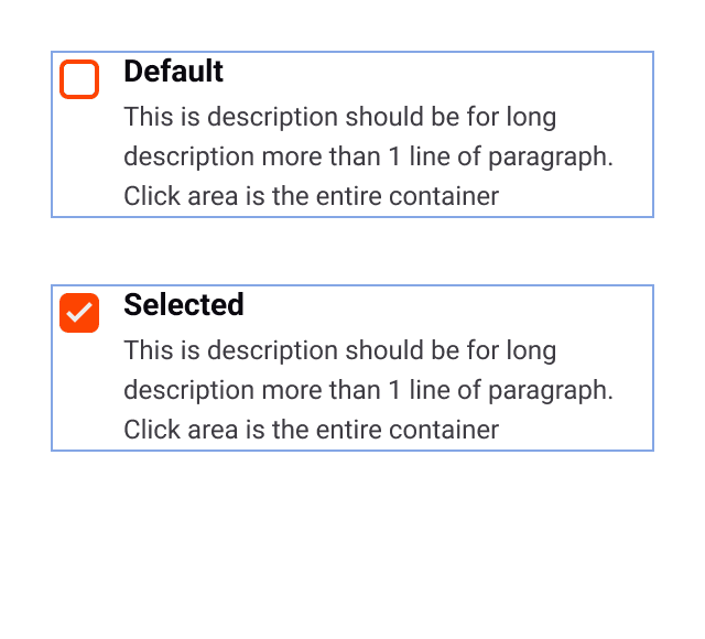
When text or description has long paragraph
If there is a checkbox component that has a long paragraph of text, then clicking on the area is the entire container including the caption.
Lesson Learned
Design Inconsistencies Have a Bigger Impact Than Expected
Small inconsistencies (e.g., different button styles) led to confusion for both users and developers.
A lack of design standards made UI/UX feel fragmented.
Cross-Team Collaboration Is Key
Designers and developers need a shared language to work efficiently.
Early alignment between teams prevents rework and speeds up implementation.
A Design System Is More Than Just a UI Kit
Beyond colors and components, it also includes guidelines, principles, and documentation to ensure long-term success.
A well-documented system helps onboard new team members faster.
Adoption Takes Time & Needs Advocacy
A design system is only valuable if teams use it consistently.
Regular training, documentation, and feedback loops are crucial for adoption.
Scalability Matters
A flexible and modular approach makes it easier to update and expand as the product evolves.
Using design tokens ensures easy adaptation across different platforms.
Migrating design system to Figma Local Variables wasn't just about improving efficiency—it was about future-proofing our design process and empowering our team to design at scale with confidence.
The Impacts
UI Consistency
Before design system: Inconsistent buttons, colors, and layouts across the product
After design system: Unified, predictable, and professional-looking UI
Development Speed
Before design system: Rebuilding UI components from scratch
After design system: Faster development with reusable components
Collaboration
Before design system: Designers and developers working with different guidelines
After design system: A shared source of truth for all teams
User Experience
Before design system: Fragmented visual language, harder to use
After design system: More seamless and intuitive experience
Scalability
Before design system: Hard to maintain and scale UI
After design system: Easily adaptable for new features & platforms
Time & Cost Efficiency
Before design system: More time spent on redesigning and fixing inconsistencies
After design system: Reduced maintenance effort and design debt