


Landing Page Design Concept
These are the design concept of landing page. These are all design exploration drafts, and are not yet live in production.
My Role :
UI designer, UX designer, visual designer
Timeline
Augustus 2024 (1 week)
4 mins
Problem Statements
A well-designed landing page is crucial for capturing user attention, driving conversions, and delivering key information efficiently. This case study explores how I conceptualized and designed a landing page that balances aesthetics, usability, and business goals. But this project is a draft and design options for the appearance of the My Legal Pro landing page.
Project Goals
The challenge was to create a landing page that:
- Communicates the brand’s value proposition effectively.
- Guides users toward a primary action (e.g., sign-up, purchase, or inquiry).
- Ensures a seamless and engaging user experience.
UI Explorations
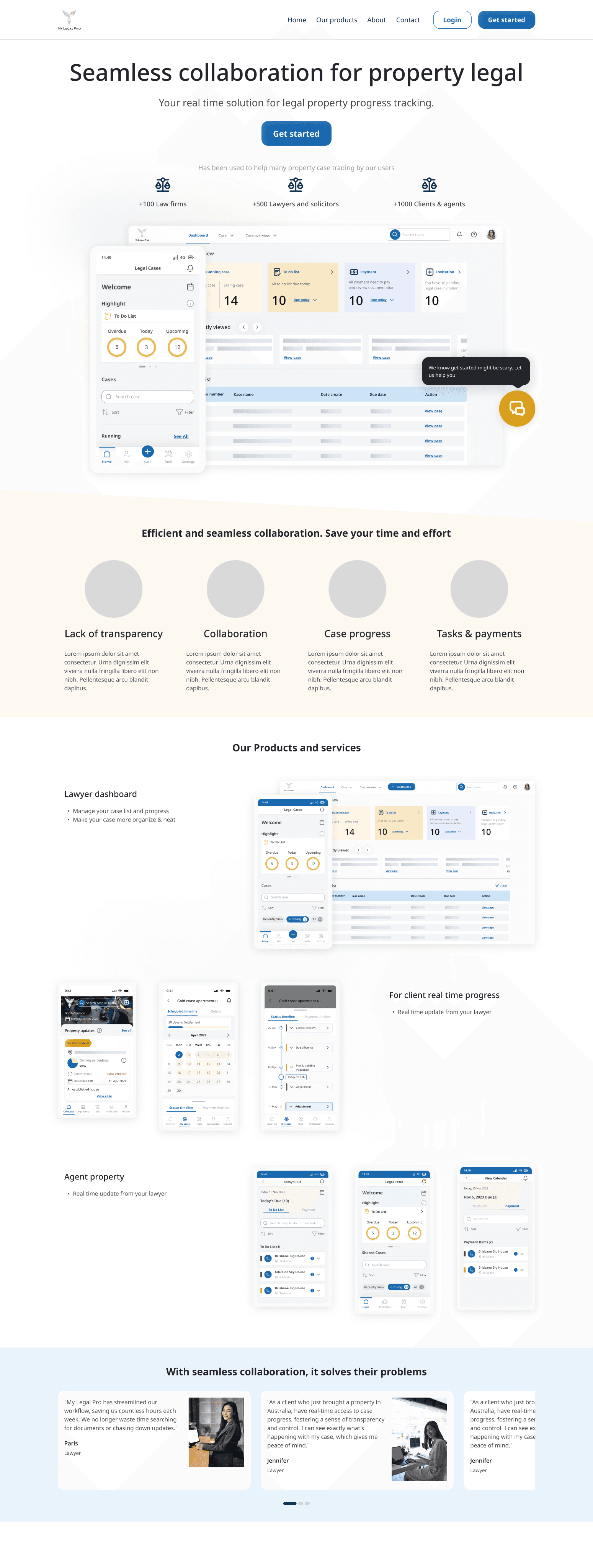
Design Option 1
This display focuses on the value proposition by displaying a photo of the solicitor using the My Legal Pro application. The purpose is to hook the problem, offer the promise.
From the very top, I wanted users to feel understood, so I led with a strong problem statement:
“Lack of legal process transparency? No more!”
This immediately captures the frustration many legal professionals and clients feel, then counters it with a reassuring promise. The use of the words real-time solution and collaboration with your solicitor provided a clear and confident introduction to the product.
To create relatability, I added persona-based tags like "Lawyer," "Client," "Property Agent," and "Law Firm" allowing each user segment to feel personally addressed.
Establishing Trust. People trust what others trust. That’s why I followed the hero section with a “trusted by” bar showing usage numbers:
+100 Law Firms
+500 Lawyers & Solicitors
+1000 Clients & Agents
These social proof stats not only show scale but also credibility. I intentionally kept this section minimal to avoid visual clutter and ensure focus remained on the numbers.
Simplifying the Core Solution. One of the challenges with legal tech is complexity how do you explain your product without overwhelming people?
I designed a clear four-column visual explanation of the core pain points and how My Legal Pro solves them:
Lack of Transparency
Collaboration
Case Progress
Tasks & Payments
Product Preview to Drive Confidence. People believe what they see. That’s why I included high-fidelity previews of both lawyer and client dashboards. These screens were chosen carefully to highlight:
Case progress
Calendar scheduling
Legal tasks and payment status
Property transaction updates
Even if users didn’t read the copy, they could visually understand how the product functioned.
Real Stories, Real Results. Next, I built a testimonial slider section featuring real users especially lawyers who talked about time savings, transparency, and peace of mind. Testimonials were written from the lens of efficiency and emotional impact, not just generic praise.
This human element added depth and built trust.
Clear and Helpful FAQ
No landing page is complete without answering real questions. I included an accordion-style FAQ section to address friction points before users even had to ask:
What are the features?
Can I share with clients?
How to use it?
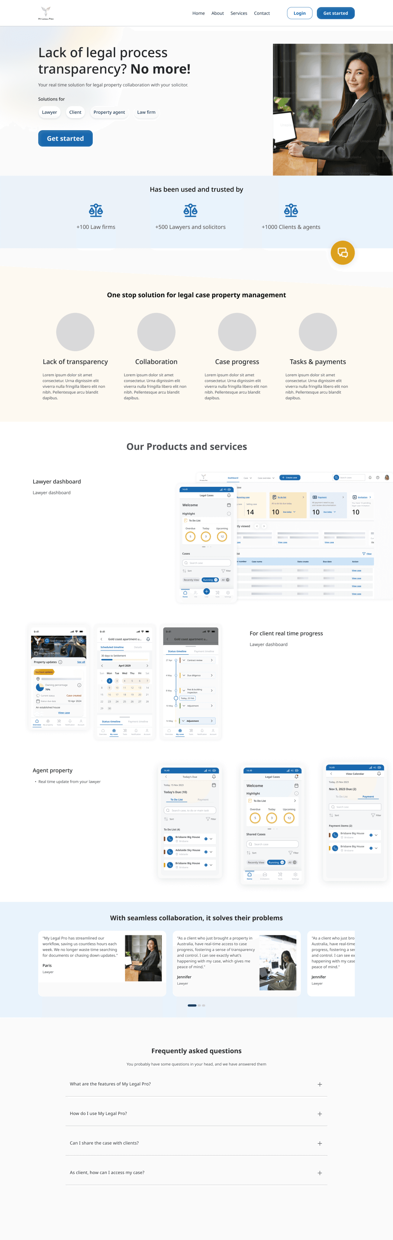
Design Option 2
As I stepped back and observed the original landing page for My Legal Pro, something wasn’t quite clicking. While it tried to address the pain point lack of transparency in legal property processes the messaging and layout didn’t feel aligned with the premium yet practical nature of a LegalTech SaaS product.
There were too many distractions upfront:
An ambiguous headline with a negative tone
Too many call-to-actions (CTAs) competing for attention
And product value was hidden too far down the page
The first impression felt cluttered. I saw the opportunity to transform this landing page into something more streamlined, scalable, and user-centric.
Product-first Visual Hierarchy. In the new version, I brought the product to the forefront earlier.
I replaced the stock-photo-heavy hero with screenshots of the actual dashboard both mobile and desktop.
Why? Users of SaaS products especially in B2B trust what they see more than what they read. By visually showing the product early, I established credibility faster.
UI screenshots are intentionally shown within realistic devices (mobile + desktop), reinforcing the cross-platform value of the product.
Refined Value Proposition Section. Right after the hero, I placed a quick, scannable "value pillars" section:
Lack of transparency
Collaboration
Case progress
Tasks & payments
Each icon and label was retained from the earlier version, but spacing and alignment were refined for better legibility.
Design Choice: I used soft background contrast to keep this section visually separated but light enough to maintain flow.
Product & Services Breakdown. Previously, product features were listed but felt fragmented and lacked context.
In the new design, I reorganized this section with:
A hero lawyer dashboard card to re-emphasize the product
Side-by-side UI cards for mobile and desktop
Categorized screens for clients, lawyers, and property agents
This allowed me to communicate not just what the product does, but who it's for and how it improves their workflow.
Human-Centered Testimonials. One insight I had was that while the platform is technical, the outcome is emotional: peace of mind, trust, and time saved.
So I reused the testimonials but redesigned them for clarity and warmth:
Real user photos (lightly retouched)
Highlighted quotes about saving time and seeing progress in real-time
Soft blue background for contrast


Design Option 3
This one contains tabbed sections for different user types (lawyer, client, agent, law firm), and currently selected tab is Lawyer.
Clean, Professional Aesthetic:
Great use of white space and soft contrast background tones.
Fits the legal-tech category really well: it feels modern yet trustworthy.
Soft Rounded Corners and Shadows:
UI cards and callouts use consistent styling — soft drop shadows, pill buttons — visually appealing and consistent.
Button Design:
CTAs like “Get Started” are visually dominant and inviting.
Use of brand blue color is consistent.
Iconography:
Icons for collaboration, case progress, etc. are simple and well-spaced.
This Project Has Been Postponed
Product manager decided this project should be postponed due to other tasks need to be done first. All of the exploration has been saved as a design draft. So we didn’t decide yet which landing page design that company will use.
What Have Done Well
Apart from the project is postponed, I think that are several things have done well, both from UX/UI design standpoint and from project execution/strategy POV.
Clear User Segmentation Strategy. The landing page design speaks directly to different user personas (Lawyer, Client, Agent, Law Firm), which shows that :
Understand that different user types have different goals and pain points.
Have built a tailored experience using tabbed navigation and role-specific content.
Help users feel that the product is designed for “someone like me.”
Why it’s great: This significantly increases conversion and engagement. It also helps sales/marketing team build more focused funnels for each segment.
Clean, Modern, Trustworthy UI.
Clean and spacious, which is important for legal tech (high-trust industry)
Uses brand aligned color palettes, soft shadows, rounded UI, good iconography
Consistent design system (typography, spacing, button styles, etc)
Why it’s great: Users trust products that “look” trustworthy. In legal and SaaS, first impressions are everything.
Clear Messaging & Value Proposition
The hero section has a strong headline/sub-headline
Product UI shots communicate functionality quickly
Self explanation how it solves core pain points (transparency, collaboration, case progress)
Why it’s great: Clear messaging is the #1 reason people convert on landing pages. You don’t make them think.
Visual Social Proof
Using real numbers like “+100 Law Firms”, “+1000 Clients” would be increasing product credibility among potential users
Testimonial with photos, which is far more credible than just text.
There’s a photo of CEO (even though on the design is still an image placeholder), adding human face to the brand.
Why it’s great: Trust-building is critical, especially for legal tech. Social proof reduces perceived risk.
Things That Can Be Improved In My Opinion
A/B testing to track which landing page is more engaging.
A simple A/B test with several users or internal teams using this product will be very useful to assess which landing page is more attractive and has the potential to increase the expected conversion rate, for example >45%. With A/B testing we can also provide a more objective assessment, in my opinion 5 - 7 participants for A/B testing are enough
Stronger Hero Sub-headline (Benefit-Oriented).
"Your real-time solution for legal property progress tracking." I think it’s descriptive, lacks emotional or outcome-driven punch. I would like to try emphasize results (faster, smoother, transparent) rather than just functionality.
Weak Scroll Anchors or CTA Re-inforcement.
I think the “Get Started” button appears in the hero but doesn’t repeat often below
FAQ Section Could Be Expanded with Real Objections.
”How do I use My Legal Pro” feels like so basic and doesn’t handle potential objections or deeper anxieties (e.g. pricing, security, integrations). I would like to do these instead:
“Is my data secure and private?”
“Does it integrate with [other tools]?”
“What’s the pricing model?”
“Can I onboard my whole team?”
Real objections = real conversions.
Visual Hierarchy in Some Sections.
The “Efficient and Seamless Collaboration” icon row uses very soft colors for the icons, making it less visually engaging. Headings and supporting text in some areas (e.g., tabbed content) could use stronger contrast or typographic variation. I would like to do these instead:
Increase icon contrast or add slight motion (hover effect).
Use bolder sub headers, bullet points, or layout variation to draw attention.