Semaai
Project type: Improvement
Have you ever think about small tweak can bring that much impact? It's cliche but this case study talks about this

Business problem: Lack of user conversion to cart page
In the current scenario, mostly users are placing orders have been guided by Semaai field staff team and often times they are doing transaction outside Semaai apk (WhatsApp or by phone). And it’s confirmed with findings both through quantitative data and qualitative research. These cases impacting new user whose not tech savvy enough to process order step and also impacting Semaai business with unprocessed checkout.
By this project, we want to increasing user conversion rate into the final step, which is checkout.
Problem Findings that we found
Conversion rate of order process is low
App session in product detail page session took too long
It can be decreasing potential order from user that use Semaai marketplace app
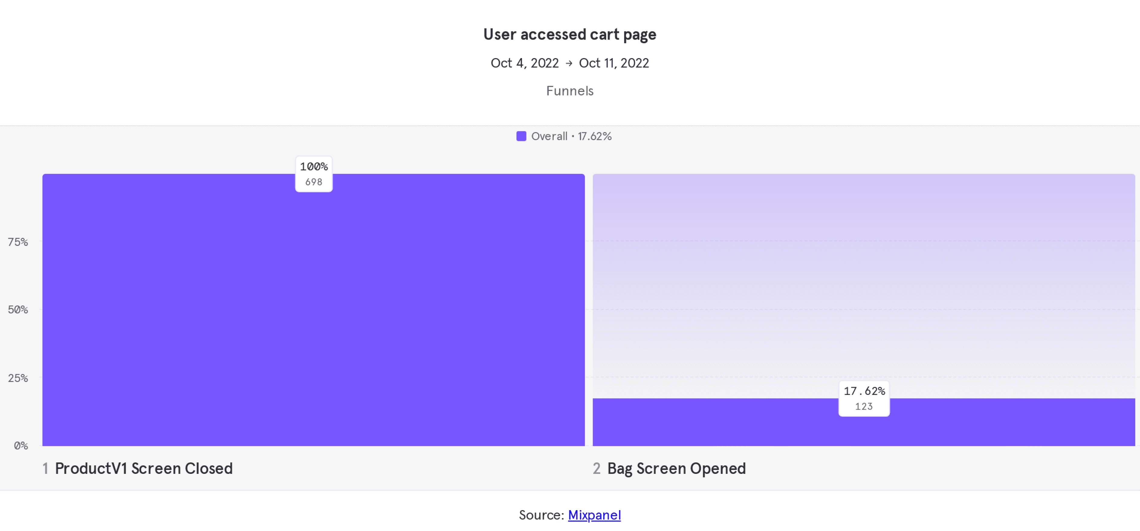
Conversion funnels
Conversion rate on last 7 days are only 17.62% from 698 users who accessing cart page. Which means drop off happened around 42%.
Quantitative research

User journey
We tracked how is user journey in the app and try to figuring out where is the bottleneck, the journey start from Product detail page, and mostly they drop off the app right after they click add to cart. We found any other problems but we will focus on the bottleneck.
Qualitative research
User interviews with couple of user in field (Solo, Pati). Understanding their shopping behavior.
User expect a guidance for next action item when they try making an order transaction.
~ Yusuf - UX researcher | Solo area ~
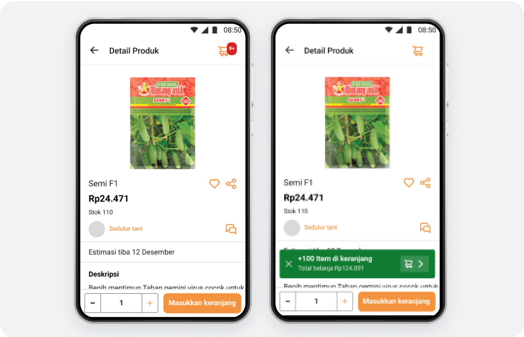
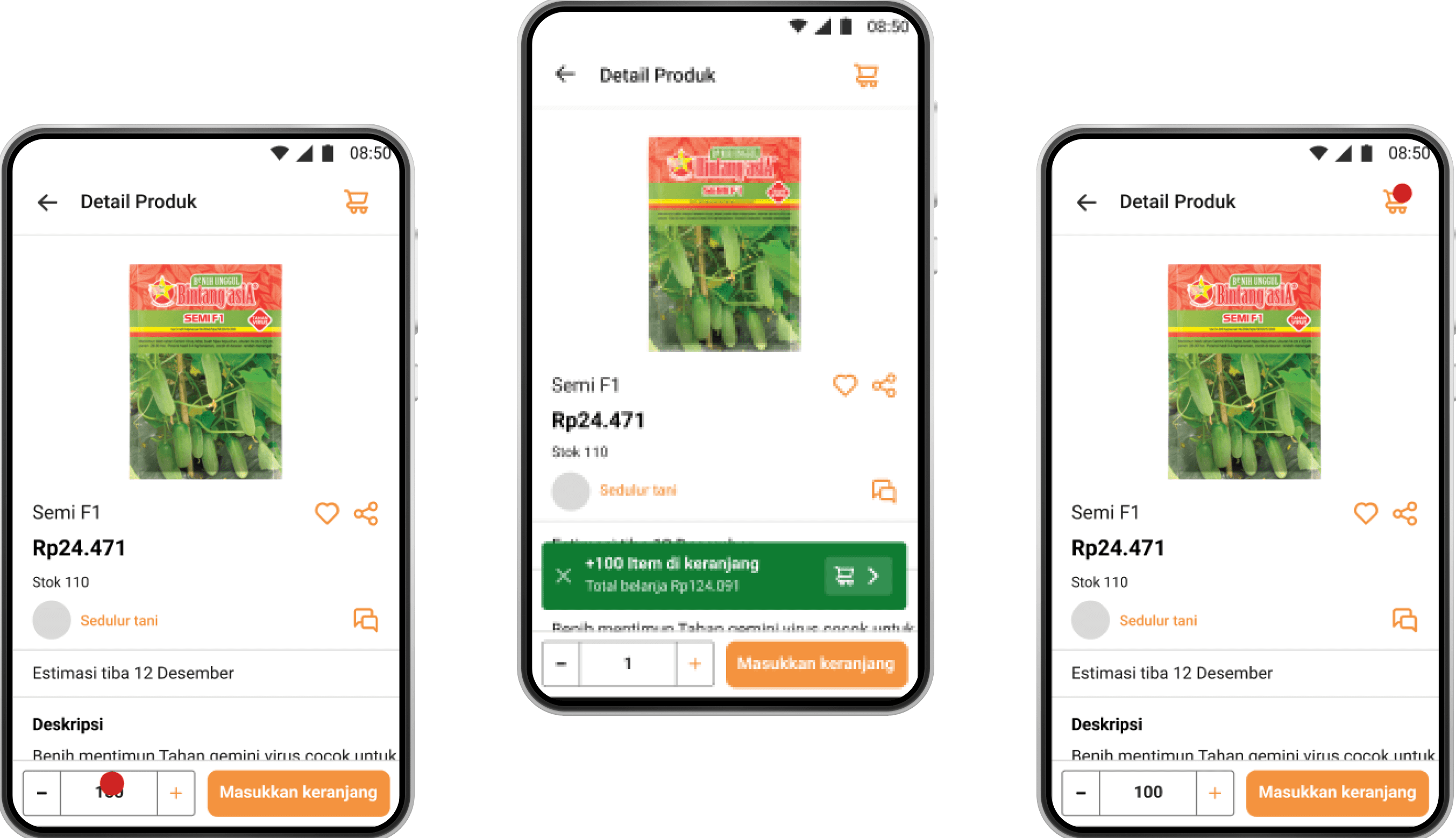
Kmaren ada user kebingungan setelah nambah product dari detailed page dan ada keterangan product berhasil di tambahkan, tapi gatau di tambah kemana productnya (means: gatau fungsi logo add to chart)
btw ini usernya pake search all product dan click product dari history searchnya.
~ Dina - UX researcher | Pati area ~
Coba dikasih semacam pop up gtu klo user udah tap button “add to cart”. Pop up nya buat persuade user lanjutin step ke halaman cart
~ Yusuf - UX researcher | Solo area ~
In short, all the problems lead to unintuitive guidance for user to continue the next step in their order journey in Semaai marketplace app.
Validating user problem: User journey bottleneck
Project goals
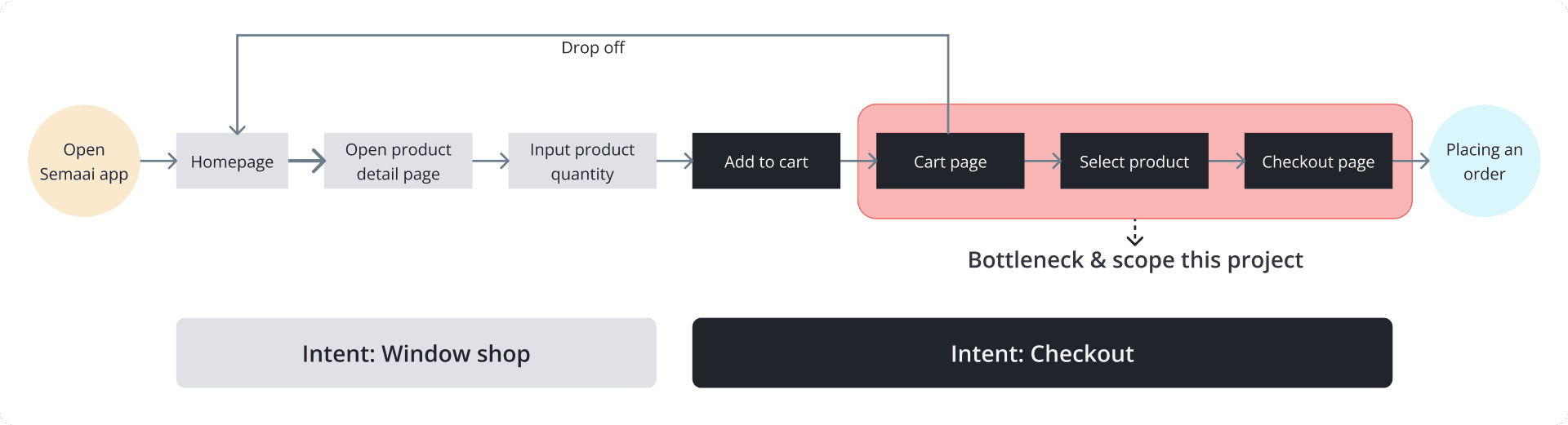
User journey. The scope of project & bottleneck is highlighted in red

Jobs to be done
We conducted an problem pooling & ideation workshop on how to create unique and clear interactions without distracting the user journey with PM, UX researcher & product designer. The purpose of this process was I want to make every related stakeholders are on the same page of understanding.


Prioritized Assumptions
From the workshop activity, we have build same understanding about the current problem :
✅ No seamless guidance for user to complete their job to be done (in here is placing an order)
✅ User experience problem in product detail page flow
✅ There are no clear action item to process next step
Top Generate Solutions
We generate top solutions for design concept and wrap it up
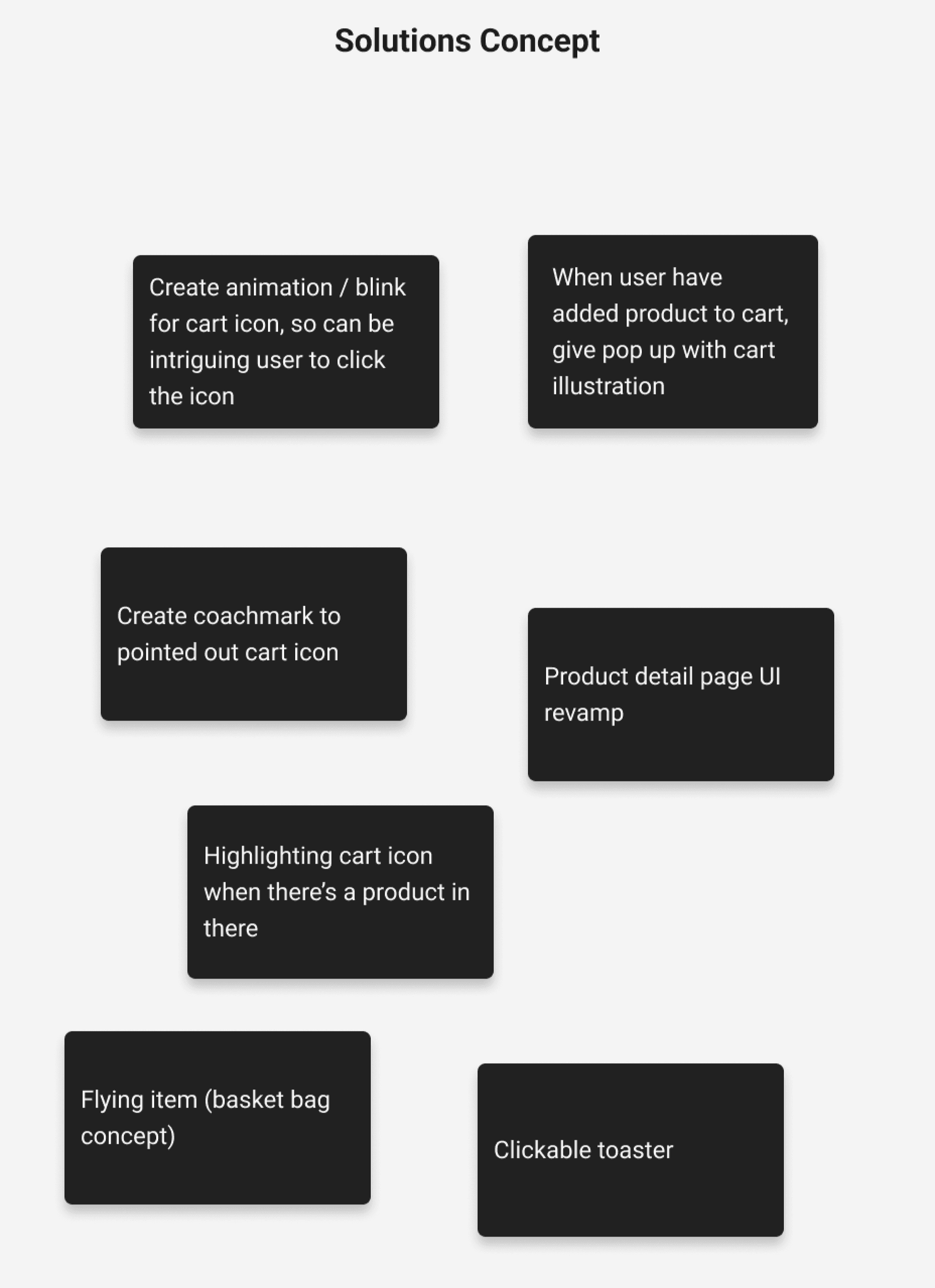
Prioritizations
After discussions with the team and various ideas and considerations, we narrowed down several ideas that might be used.

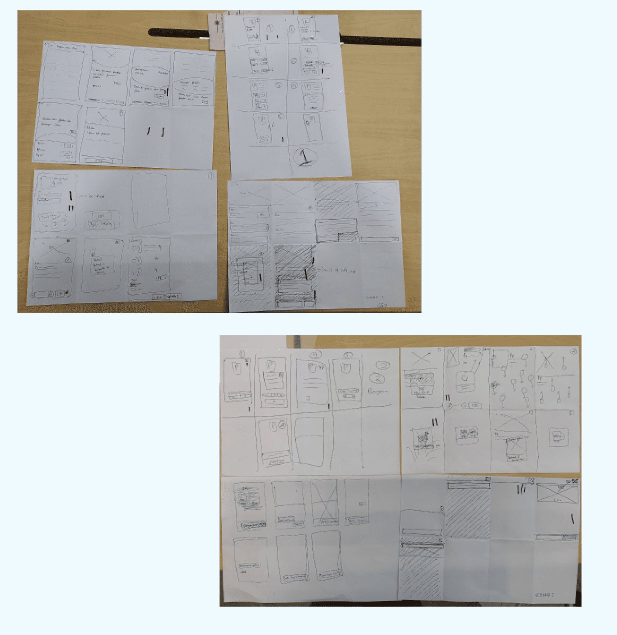
Design concept phase
I try create low fidelity design exploration based on prioritized ideation, and we conduct usability testing to validate our ideation
Toaster
Blinking
Flying badge


Persona criteria
Purpose
To make sure our solution is work, we want to test our solution to end user and others insight for this project. If we test the Fast Checkout, we will get our new user to click the cart icon faster which will increase retention rate by up to 5% in one month because the cart icon is designed interactively and easily understood by the user. (Dina - UX researcher).
Task that given on this UT is Adding product to cart and continuing order flow until cart page. UT participants are 9 users
Assumption : User can aware the flow of checkout product
User can understand the flow of checkout product
User can understand design element in product detail page while adding product to cart
Usability testing results

70%
User tap into toaster when they did the task. They feel toaster guide them to continuing the step
90%
Flying item make it easy for user to find out cart placement
90%
Blinking on cart icon is nice to have. It also works to give hints cart placement and item on cart that need to checkout

Hi-fidelity design
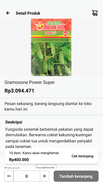
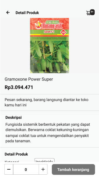
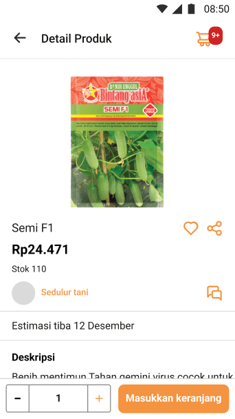
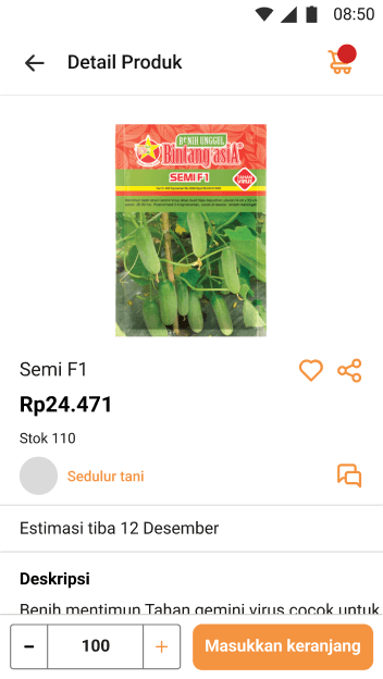
After usability testing has conducted and we got positive feedback, that means we are good to go with the design concept above. I don’t change current interface in product detail page. We keep the interface as it was we only add 3 additional items.
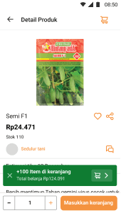
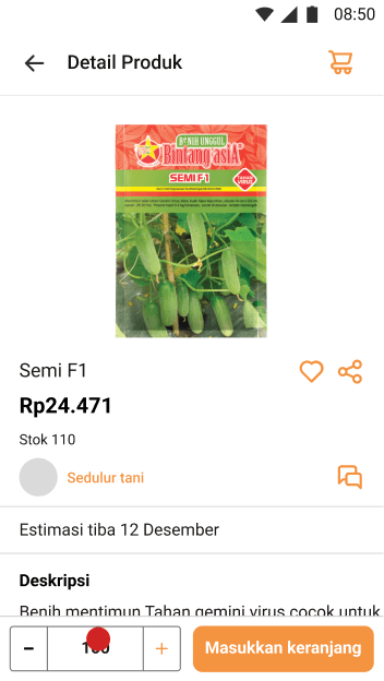
Before

After

Metrics Results
After this feature has been released on app in 3 month, we track how the design performance in analytical. And we did compare before and after this feature has release

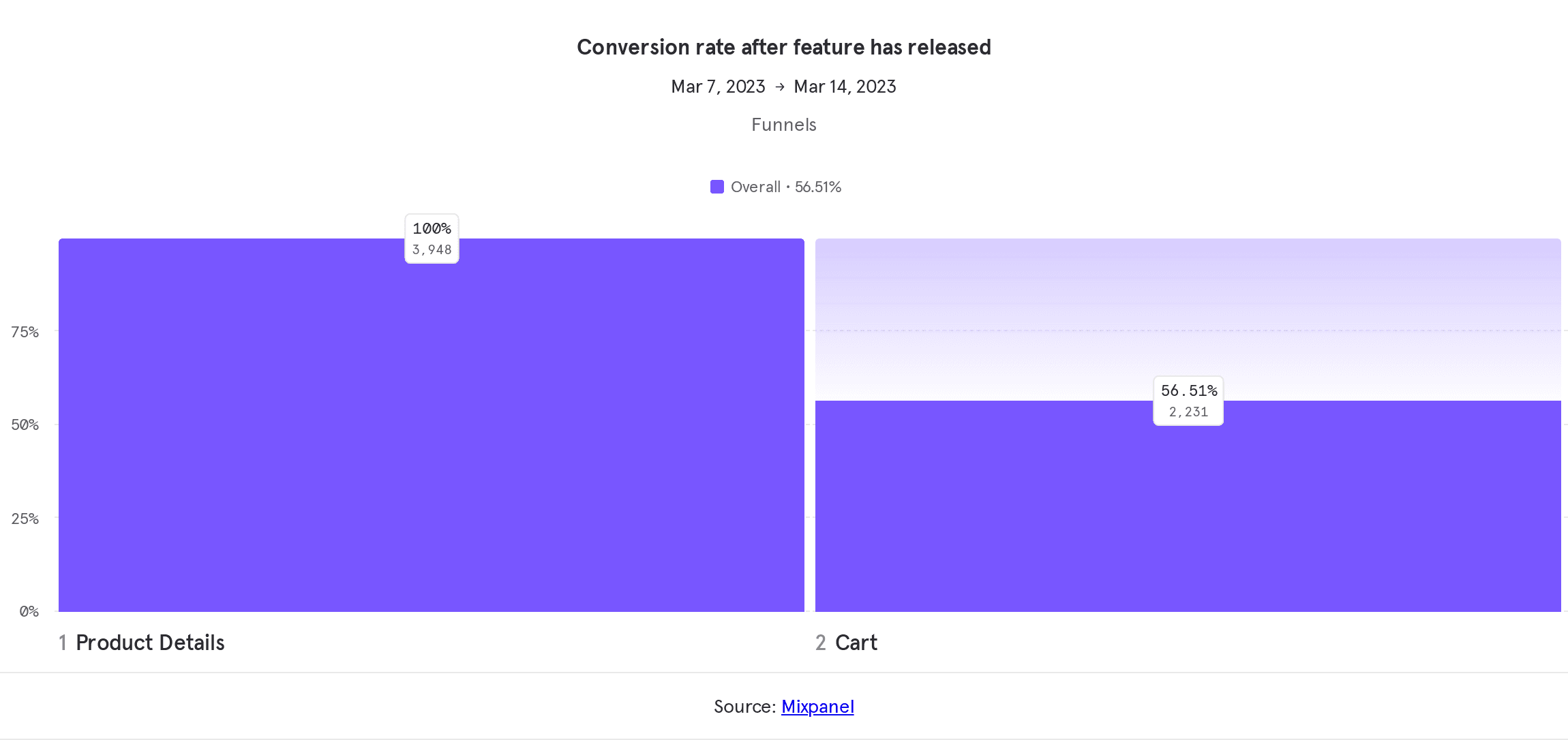

After this feature has been released on app in 3 month, we track how the design performance in analytical. And we did compare before and after this feature has release
Small things but impactful
Peripheral vision is used more than central vision to get the gist of what to see. It was just a small thing to add something that catch user attention, no need complicated design and dev to build it, but its enough to make conversion increased.
Understanding user intention
On this project, we found that user intention divided by 2, window shopping and intent to buy. Each of these intention needs a different approaches to make an transaction opportunity.
Thanks for reading
Check my other projects

Semaai marketplace application (MVP v1.0)
Semaai is full stack solution for Indonesian farmers and agri MSMEs with operations area is in rural area with a mission to uplift the livelihood and income of 55 million farmers in Indonesia through a highly trusted network of MSMEs (Toko Tanis) and farmer groups through digital B2B marketplace.
Timeline
Q1 2022
Read case study

My Legal Pro | Dashboard MVP version
My legal pro is a legal tech company based in Australia and makes digital products related to legal case management for buying and selling property.
Timeline
Q1 2024
Read case study


Revamp : Semaai agent app and daily visit recommendation
Semaai agent application is a productivity application that is used by Semaai sales teams in the field for their selling activities such as attendance, checking achievements and profiling Semaai customer stores and others productivity.
Timeline
Q3 2023
Read case study